

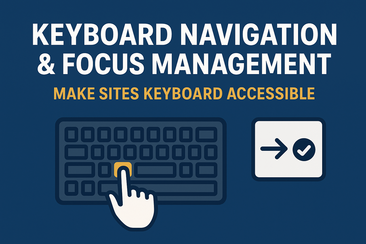
Keyboard Navigation & Focus Management — Make Sites Keyboard Accessible
Keyboard Navigation & Focus Management
Introduction
Keyboard accessibility ensures that every interactive element on a website or application can be used without a mouse. This capability is critical for users with motor impairments, screen reader users, and power users who prefer efficient keyboard commands. Proper focus management complements this by controlling where focus moves, ensuring that users can operate and understand the interface effectively.
According to the Web Content Accessibility Guidelines (WCAG), interactive elements must be fully navigable via keyboard input, without requiring pointer devices. This principle is central to the Perceivable, Operable, Understandable, and Robust (POUR) framework of accessibility.
Why Keyboard Accessibility Matters
Good keyboard navigation benefits everyone, not just users with disabilities. Many users rely on keyboards for speed and convenience. For those using assistive technologies such as screen readers or speech recognition systems, the keyboard provides the main means of interaction.
- Users with mobility challenges may not be able to use a mouse.
- Screen reader users depend on keyboard commands to navigate through content and landmarks.
- Users often use the keyboard for efficiency, for example when filling forms or navigating interfaces with repetitive actions.
If your digital experience cannot be navigated or controlled using only the keyboard, it fails both accessibility and usability standards.
Core WCAG Principles for Keyboard Navigation
1. All interactive elements must be reachable by keyboard
Every focusable element—links, buttons, form fields, and custom components—should be accessible through the Tab key. Use Shift + Tab to navigate backward. If an element is interactive visually, it must also be operable through keyboard focus.
2. Visible focus indicator
The current focus target must always be visually highlighted. Custom designs must not remove the browser’s default focus outline unless replaced with a clearly visible alternative. According to WCAG 2.2 Success Criterion 2.4.7 (Focus Visible), visible focus is essential to help users track navigation during keyboard interaction.
3. Logical focus order
Ensure focus follows a predictable reading and interaction order, matching the visual flow of the content. For example, left‑to‑right and top‑to‑bottom on Western language sites. Avoid breaking this order by using arbitrary tabindex values unless necessary.
4. Avoid keyboard traps
Users must be able to enter and exit any interactive component using standard keys. Dialogs, widgets, and modals should never trap focus—pressing Tab must allow users to move through and out of the component cleanly.
Focus Management Patterns
Focus management is the deliberate control of where the user’s focus moves as they navigate or perform actions. It ensures context continuity, reduces confusion, and provides clear orientation.
- Initial Focus: Set focus on the first logical element when new content or dialogs open. For example, the dialog title or the first form input.
- Return Focus: When closing modals, side panels, or pop‑ups, return focus to the previously interacted element.
- Skip Links: Offer “Skip to main content” links to help users bypass repetitive navigation menus.
- Focusable Custom Components: Ensure custom controls built with
divorspanelements are assigned propertabindexand ARIA roles.
Best Practices for Implementation
- Use semantic HTML: native elements like
<button>,<a>, and<input>already support keyboard interaction and focus. - Use
tabindex="0"for adding elements into the natural tab order andtabindex="-1"for focusing via script only. - For dynamic content or SPAs, manage focus programmatically using JavaScript’s
element.focus()to guide users. - Never remove default outline styling without providing a custom visible alternative (e.g., a thick border or color change).
- Support all major keyboard interactions, including Enter, Space, Arrow keys, and Esc for closing dialogs.
Testing Keyboard Accessibility
Keyboard testing is simple but vital. To perform a quick audit:
- Unplug your mouse or disable your trackpad.
- Navigate the page using Tab, Shift + Tab, Enter, Space, and Esc.
- Verify that every interactive item can be reached and activated in a logical sequence.
- Confirm that visible focus indicators are always apparent.
- Test modals, dropdowns, and menus to ensure focus does not get trapped.
Tools such as WAVE, axe DevTools, and Lighthouse can help flag missing focus states or low keyboard accessibility.
Common Issues & How to Fix Them
- Focus disappearing during page reloads or AJAX updates: Re-establish focus manually on key landmarks or main headings.
- Interactive elements missing keyboard support: Replace
divorspanelements with semantic tags like<button>or add properroleandtabindex. - Hidden elements receiving focus: Ensure hidden or collapsed elements use
display:noneoraria-hidden="true"to remove them from tab order. - Modals not confining focus within: Use scripts to trap focus inside the modal while it’s active, then return focus upon closing.
Conclusion
Ensuring your website supports full keyboard operation is one of the most practical and high‑impact accessibility improvements. Proper focus order and clear visual indicators make interactions predictable, empowering keyboard and assistive technology users alike.
Next steps: Conduct a full keyboard‑only audit of your site, implement focus guides, and test frequently during development using real devices and accessibility tools.


