
Inclusive Typography & Readability — WCAG Text & Contrast Rules
Inclusive Typography & Readability — WCAG Text & Contrast Rules
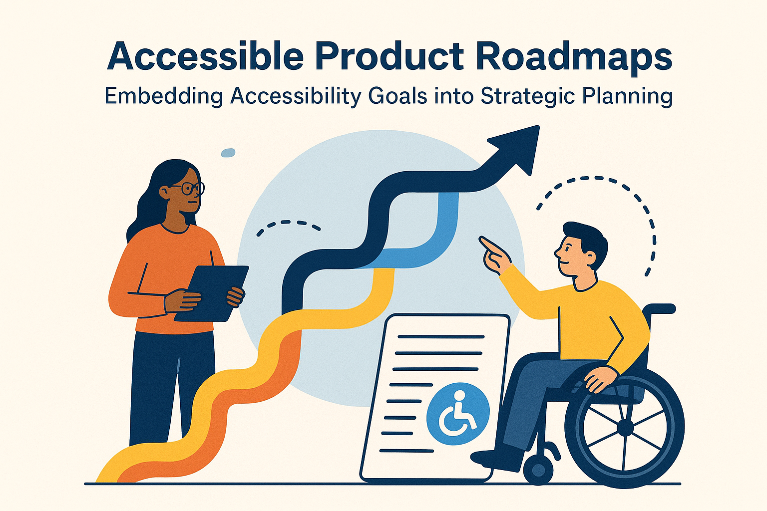
Introduction
Typography is the foundation of accessible content. Even when interfaces are technically functional, poor font choices, weak color contrast, or crowded line spacing can make text unreadable for many users. Inclusive typography ensures that every reader — regardless of vision, device, or lighting — can comfortably process and understand information.
According to the Web Content Accessibility Guidelines (WCAG), text readability forms part of the Perceivable and Understandable principles. WCAG provides measurable criteria for text color contrast, resizing, and spacing so designers can verify visual clarity through objective standards.
Why Readable Typography Matters
Text is still the most common medium for delivering information. If your typography isn’t accessible, the message fails, no matter how sophisticated your design. Readable text supports users with low vision, dyslexia, color vision deficiency, and temporary conditions like glare or small mobile screens.
- High contrast allows users with limited vision to distinguish text from background colors.
- Clear fonts and spacing improve comprehension and retention across literacy levels.
- Scalable text supports those using screen magnifiers or reading on small displays.
Good typography creates both comfort and inclusion — an ergonomic reading experience for every user.
Core WCAG Success Criteria for Typography & Text
1.4.3 — Contrast (Minimum) (Level AA)
Text and images of text must have a contrast ratio of at least 4.5:1 for normal text and 3:1 for large text (18 pt or 14 pt bold). This ensures visibility in various conditions and for users with reduced contrast sensitivity.
1.4.6 — Contrast (Enhanced) (Level AAA)
For enhanced readability, AAA requires 7:1 for normal text and 4.5:1 for large text. Meeting this level improves comfort for everyone.
1.4.4 — Resize Text (Level AA)
Users must be able to increase text size up to 200 % without assistive technology and without loss of content or functionality. Use relative units like em or rem for scalable layout.
1.4.12 — Text Spacing (Level AA)
WCAG 2.1 introduced testable metrics to ensure sufficient spacing between lines and letters. Users must be able to override spacing via style sheets without losing content or functionality.
Minimums:
- Line height (line spacing): 1.5 × font size
- Paragraph spacing: 2 × font size
- Letter spacing (tracking): 0.12 × font size
- Word spacing: 0.16 × font size
1.4.10 — Reflow
Content must reflow within a 320 px‑wide viewport (roughly 400 % zoom on desktop) without horizontal scrolling. Responsive typography enables comfortable reading at large magnifications.
Choosing Accessible Typefaces
Font choice impacts legibility and fatigue. While style conveys tone, accessibility favors function — clarity, minimal decoration, and consistent letter shapes.
- Use sans‑serif families such as Arial, Open Sans, Lato, or Inter for long passages of text on screens.
- Avoid condensed, cursive, or novelty fonts that distort letterforms.
- Limit the total number of font families to two within a project for consistency.
- Reserve ALL CAPS for short labels — it reduces shape recognition when overused.
Always define fallback fonts in font-family stacks to maintain readability if custom fonts fail to load.
Optimal Font Size and Line Length
Text size and line length work together to establish comfortable reading rhythm.
- Minimum body copy size: 16 px (1 rem) is recommended for desktop and mobile interfaces.
- Keep line length between 45–80 characters (full words and spaces) for paragraph text.
- For narrow columns, reduce font size slightly but preserve line height and contrast ratios.
html { font-size: 100%; }
body { font-size: 1rem; line-height: 1.6; max-width: 70ch; }
Shorter line lengths improve focus, especially for users with dyslexia or attention disorders.
Applying WCAG Contrast Ratios
Designers should verify contrast objectively rather than judging by eye.
- Minimum 4.5:1 for regular text — most body copy and labels.
- 3:1 for large text (18 pt or 14 pt bold).
- 7:1 for enhanced AAA conformance.
Color combinations are not inherently accessible — contrast depends on hue and brightness interaction.
/* Example accessible palette */
.text-dark { color: #111; background-color: #fff; } /* 15:1 contrast */
.text-light { color: #fff; background-color: #1a1a1a; } /* 13:1 contrast */
Use trusted tools such as WebAIM Contrast Checker, Contrast Ratio Calculator, or axe DevTools to test ratios across themes and states (hover, focus, disabled).
Improving Readability Through Spacing
Adequate spacing around words and lines prevents visual crowding and helps the eye return to the next line. In CSS:
body {
  line-height: 1.6;
  letter-spacing: 0.03em;
  word-spacing: 0.04em;
  margin-bottom: 1em;
}- Use
emorremunits to preserve proportionality when zooming. - Adjust line height and margin in responsive breakpoints to accommodate different screens.
Preventing Layout Breakage at Large Zoom Levels
When users increase zoom or override styles with high‑contrast modes, your layout should gracefully adapt. Developers can test 400 % zoom or Windows Magnifier to ensure no text overlaps or off‑screen overflow.
- Use fluid containers (max‑width + relative units) instead of fixed pixels.
- Allow text wrapping; prevent truncation with
overflow-wrap: break-word;. - Avoid fixed‑height elements that clip enlarged text.
Readable Alignment and Justification
Text alignment significantly affects legibility. Left‑aligned, ragged‑right paragraphs work best for most scripts written left to right.
- Avoid fully justified text — inconsistent spacing produces “rivers” that disrupt eye flow.
- Maintain predictable alignment in mixed layouts (avoid sudden center‑aligned blocks).
- For right‑to‑left languages, respect native directional flow and swap alignment automatically using
dir="rtl".
Using White Space and Hierarchy
Ample white space differentiates sections and reduces reading fatigue. Combine spacing and typographic hierarchy (headings, weight, color) to guide attention without decorative overload.
- Use consistent heading levels (
<h1>to<h6>) and align them in a clear visual order. - Increase margin and padding around important sections to improve scanability.
- Pair type sizes using a scale (1 : 1.333 or 1 : 1.25) to maintain cohesive hierarchy.
Testing Typography Accessibility
- Use browser zoom (200% and 400%) to check reflow and legibility without horizontal scrolling.
- Validate contrast ratios for headings, body text, and UI icons in light and dark themes.
- Check font rendering on multiple devices and operating systems.
- Use screen reader modes to review reading order and heading hierarchy.
Common Typography & Contrast Issues
- Low contrast: Light gray text on white reduces readability — darken foreground color to meet 4.5:1 ratio.
- Overusing uppercase: All‑caps headlines reduce readability for long strings; use sparingly.
- Insufficient spacing: Increase line and word spacing to avoid crowding.
- Fixed‑pixel font sizes: Switch to relative units to enable zoom scaling.
- Fully justified text: Replace with left alignment to avoid uneven spacing.
Conclusion
Inclusive typography is measurable, testable, and essential to accessibility. Meeting WCAG rules for contrast, spacing, and flexibility ensures that text remains perceivable across devices and abilities. Readable design supports comprehension, retention, and user comfort — the hallmarks of true accessibility.
Next steps: Audit your text contrast, spacing, and alignment against WCAG 2.2 criteria. Adjust color tokens, use relative units, and test with different viewing conditions to confirm a universally readable experience.