
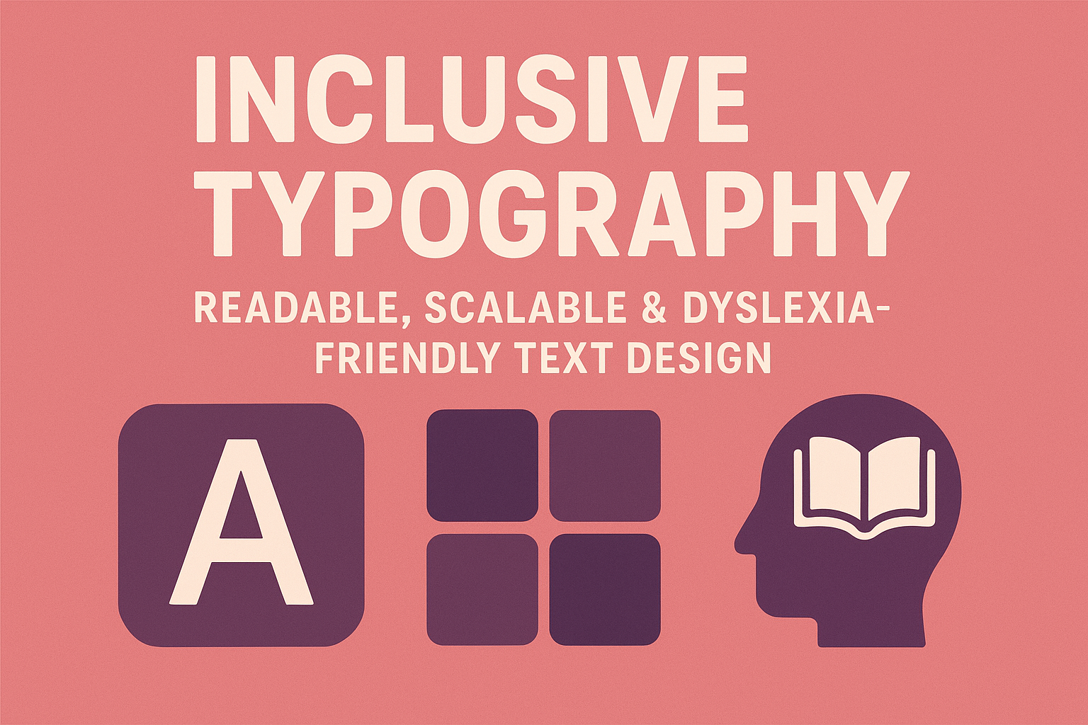
Inclusive Typography — Readable, Scalable & Dyslexia‑Friendly Text Design
Inclusive Typography — Readable, Scalable & Dyslexia‑Friendly Text Design
Introduction
Typography does more than present words — it directly affects comprehension, usability, and comfort. For readers with dyslexia, low vision, or cognitive differences, poor typography can turn content into clutter. Inclusive typography focuses on clarity and adaptability, ensuring text is visually legible, semantically structured, and flexible across all environments. Designing accessible type is not just a style choice — it’s a communication necessity.
This guide covers practical steps for readable, scalable, and dyslexia‑friendly typography that aligns with WCAG 2.2 Success Criteria 1.4.4 (Resize Text) and 1.4.8 (Visual Presentation).
Why Inclusive Typography Matters
- Over 10 percent of people experience dyslexia or related reading challenges.
- Low‑contrast, dense, or inconsistent text can obstruct comprehension and focus.
- Readable type benefits everyone — from screen reader users to mobile readers in bright light.
Typography designed for accessibility creates comfort, trust, and comprehension across age, language, and ability.
Choosing Accessible & Dyslexia‑Friendly Fonts
Not all fonts are created equal. The wrong typeface can introduce unnecessary complexity or misinterpretation of letter shapes.
- Prefer sans‑serif fonts like Arial, Open Sans, Tahoma, Verdana, or Helvetica for digital interfaces.
- Use dedicated dyslexia‑friendly fonts where possible (e.g., OpenDyslexic, Lexend, Atkinson Hyperlegible).
- Avoid serif fonts in body text (their ornamentation reduces letter recognition speed for many users).
- Make sure “l” (L), “1” (one), and “I” (capital i) are visually distinct in your font choice.
body {
  font-family: "Open Sans", Arial, sans-serif;
  font-size: 1rem; /* 16px default for comfort */
  line-height: 1.6;
}
Optimizing Readability
1. Size & Scaling
- Default to at least 16 px (1 rem) body text.
- Allow users to resize up to 200% without loss of content or functionality (WCAG 1.4.4).
- Use relative units (
rem,em,vw) instead of fixed pixels to adapt across devices.
2. Line Length & Spacing
- Maintain 45‑75 characters per line for optimal reading flow.
- Use line height (1.5–1.8×) for comfortable visual scanning.
- Include extra word and paragraph spacing to improve tracking for dyslexic readers.
p {
  max-width: 70ch;
  line-height: 1.6;
  letter-spacing: 0.02em;
  word-spacing: 0.16em;
}
3. Alignment & Structure
- Left‑align text; avoid full justification to prevent uneven spacing “rivers.”
- Use clear headings with hierarchical contrast between levels (WCAG 1.3.1).
- Keep paragraphs short and visually separated with sufficient margin.
Contrast & Color Choices
- Maintain minimum contrast ratio of 4.5:1 for normal text and 3:1 for large text.
- Use off‑white backgrounds for reduced glare (e.g., #f5f5f5 instead of #fff).
- Provide dark mode alternatives that preserve contrast levels.
- Avoid color as the sole indicator for meaning (link text should also be underlined or bold).
Responsive Typography
Responsive typesetting ensures legibility across viewports, languages, and user preferences.
html {
  font-size: clamp(1rem, 1vw + 0.8rem, 1.25rem);
}
- Use fluid type scaling with
clamp()for balance between desktop and mobile. - Test typography on touch devices and zoom interfaces to verify text scaling and line wrapping.
Dyslexia‑Friendly Text Practices
- Avoid italics — use bold for emphasis instead.
- Prevent uppercase blocks — they slow reading and remove word shape clues.
- Ensure ample space between lines and paragraphs to aid tracking and focus.
- Offer reading mode toggles or “easy read” layouts with simplified fonts and spacing.
Testing Typographic Accessibility
- Resize text to 200% and confirm no horizontal scrolling or cut‑off elements.
- Use contrast checkers (WebAIM Checker) to verify visual ratios.
- Conduct user testing with individuals with dyslexia and low vision to gauge comfort and clarity.
- Test screen reader output for semantic headings, lists, and emphasis structure.
Common Typography Barriers
- Small or fixed font sizes: Prevents user scaling and damages readability.
- Poor contrast: Light gray text on white backgrounds reduce visibility.
- All caps or italicized paragraphs: Hard to decode for dyslexic readers.
- Unstructured hierarchy: No semantic headings for screen reader navigation.
Best Practices
- Use semantic HTML (headings, lists, emphasis) to convey structure programmatically.
- Adopt accessible fonts available on web and device systems to avoid substitution issues.
- Offer user preferences for font size and reading modes in your UI settings.
- Document font accessibility rules and tokens in your design system for consistency.
Conclusion
Inclusive typography bridges communication barriers and supports readers of every ability. Readable fonts, clear spacing, and scalable layouts help users retain information and enjoy content comfortably on any screen. By testing for dyslexia friendliness and WCAG compliance, you build trust through design that communicates clearly — to everyone.
Next Steps: Audit your current typography for font legibility and contrast. Add font scaling controls in settings, and include typography accessibility tokens in your design system documentation.