
Designing for Low‑Vision Users — WCAG Best Practices
Designing for Low‑Vision Users — WCAG Best Practices
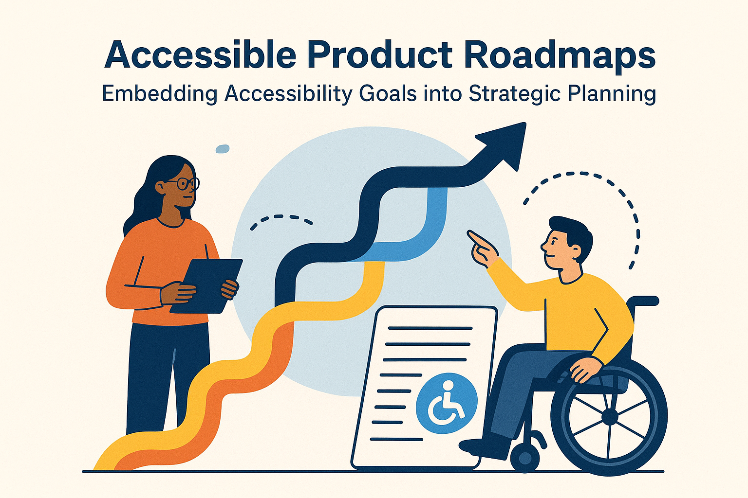
Introduction
Low‑vision users are a large and diverse group who can perceive some visual information but experience difficulty reading small text, discerning color differences, or tolerating glare. For them, a poorly designed interface can make digital content unusable. Building for low‑vision accessibility means considering color, contrast, typography, spacing, and scalability — all values rooted in the Web Content Accessibility Guidelines (WCAG).
Many of these improvements also help everyone: clearer text benefits mobile users outdoors, better contrast helps in dim environments, and flexible layouts suit any screen size. Designing for low vision is inclusive design in action.
Understanding Low Vision
Low vision refers to permanent visual impairment that cannot be fully corrected with glasses or surgery. People with low vision may have reduced acuity, tunnel or peripheral loss, light sensitivity, or difficulty distinguishing hues. They rely on browsers’ built‑in zoom, high‑contrast themes, and personalized color adjustments to access information.
Websites optimized for low‑vision users:
- Handle zoom or magnifier modes without breaking layout
- Provide sufficient contrast for text and interface elements
- Include clear focus highlights and spacious layouts
- Adapt gracefully to dark mode or custom color themes
Relevant WCAG Principles and Success Criteria
Several WCAG 2.2 success criteria directly benefit users with low vision. Designers and developers should prioritize:
- 1.4.3 Contrast (Minimum): Text and images of text must reach a contrast ratio of 4.5 : 1 for normal text, 3 : 1 for large text.
- 1.4.4 Resize Text: Users can resize text up to 200 % without loss of content or functionality.
- 1.4.10 Reflow: When zoomed to 400 %, content reflows vertically without horizontal scrolling.
- 1.4.11 Non‑Text Contrast: Buttons and graphic icons maintain 3 : 1 contrast against adjacent colors.
- 1.4.12 Text Spacing: Increased line, paragraph, and letter spacing must not break layout or cause text clipping.
Meeting these criteria ensures that magnifiers, high‑contrast modes, and custom style adjustments continue to present clear, navigable content.
Color and Contrast
Why Contrast Matters
Strong contrast helps all readers perceive text comfortably under varying conditions and lighting. Low‑vision users rely heavily on contrast differences because faint tones disappear against similar backgrounds. WCAG sets measurable ratios that prevent these barriers.
WCAG Contrast Requirements
- Normal text: 4.5 : 1 (A and AA levels)
- Large text: 3 : 1 for bold ≥ 14 pt or regular ≥ 18 pt
- Enhanced contrast AAA: 7 : 1 (standard reading comfort target)
- Non‑text elements: 3 : 1 contrast between icon/button and adjacent color
/* Example contrast-safe style */
.text {
  color: #111;
  background-color: #fff;
}
.button {
  background-color: #0048aa;
  color: #fff;
}
Tools such as WebAIM Contrast Checker and axe DevTools measure ratios during design reviews.
Typography for Legibility
Font Selection
- Use low‑distraction sans‑serif fonts (Open Sans, Lato, Roboto, Inter).
- Avoid decorative or condensed type that loses clarity when scaled.
- Set minimum base font size at 16 px (1 rem) for paragraph content.
Size and Scalability (1.4.4)
Relative units allow users to enlarge text without breaking layouts. Replace fixed pixel values with em or rem units so zooming scales uniformly across components.
html { font-size: 100%; } /* 16 px */
body { font-size: 1rem; line-height: 1.6; }
h1 { font-size: 2rem; }
Spacing (1.4.12 Text Spacing)
- Line height ≥ 1.5 × font size (prevents crowding)
- Paragraph spacing ≥ 2 × font size
- Letter spacing ≥ 0.12 × font size
- Word spacing ≥ 0.16 × font size
Proper spacing reduces visual fatigue and makes following lines easier for magnifier users.
Layout and Reflow (1.4.10)
When users zoom to 400 %, the page width effectively shrinks to 320 px. To remain accessible, content must reflow vertically instead of forcing horizontal scrolling. Responsive design achieves this naturally with flexbox and CSS grid.
.container {
  display: flex;
  flex-wrap: wrap;
}
img, video {
  max-width: 100%;
  height: auto;
}
- Use fluid grids and relative units for widths and margins.
- Ensure images and text wrap instead of cropping or overlapping.
- Avoid disabling zoom with viewport meta tags like
user-scalable=no.
Testing at 400 % zoom simulates real magnifier experiences — the page should scroll only vertically and retain all functions.
Color Use Beyond Contrast
Avoid Using Color Alone
Color is helpful, but not sufficient to carry meaning.
Roughly 8 % of men and 0.5 % of women have color‑vision deficiency. If you use red for errors and green for success, add icons or textual feedback so no information relies solely on hue.
<p class="error">
  <span aria-hidden="true">⚠️</span> Incorrect password.
</p>
Safe Color Palettes
- Check contrast under grayscale to ensure sufficient difference.
- Avoid color pairings commonly confused by color‑blind users (red/green, blue/purple).
Interactive Elements and Focus States
For low‑vision users, perceiving which element is active or focused is critical. WCAG 2.2 strengthens “Focus Visible” requirements by setting contrast and outline minimums.
:focus-visible {
  outline: 3px solid #ffb400;
  outline-offset: 2px;
}
- Maintain contrast ≥ 3 : 1 between focus indicator and background.
- Do not remove browser outlines without replacement.
- Check hover/focus color states in both light and dark themes.
Supporting User Preferences
Dark Mode and High‑Contrast Themes
Respect the user’s OS color preference using @media (prefers-color-scheme). Ensure both themes maintain contrast within WCAG limits.
@media (prefers-color-scheme: dark) {
  body { background-color: #111; color: #f8f8f8; }
  a { color: #58a6ff; }
}
Also test Windows High‑Contrast Mode (HCM). Avoid placing essential information in background images, as HCM may remove them entirely.
Forms and Input Elements
Forms demand high visibility and clear context. Input borders, labels, and error messages must remain visible at all zoom levels.
- Use persistent labels; placeholders are insufficient when text vanishes upon typing.
- Ensure error messages are both color contrasted and textual (e.g., “Invalid email address”).
- Leave ample vertical spacing between inputs to prevent focus loss at 200 % zoom.
<label for="email">Email</label>
<input id="email" type="email" aria-describedby="email-error">
<span id="email-error" role="alert">Please enter a valid email address.</span>
White Space and Layout Clarity
Visual simplicity reduces strain. Generous spacing guides the eye and helps focus on key content areas.
- Keep line length 40 – 70 characters for comfortable reading.
- Use blank space between paragraphs to separate ideas.
- Limit two‑column layouts under 400 % zoom to avoid extra scrolling.
Testing Techniques
Zoom and Magnifier Testing
- Open your page and zoom to 200 % and 400 %.
- Check that navigation still works and text is fully visible.
- Ensure interactive controls remain usable without horizontal scroll.
Contrast and Themes
- Validate contrast using browser extensions and hand‑held color pickers.
- Switch between dark and light mode to confirm legibility of borders and icons.
User Testing
Recruit participants with low vision to navigate prototypes with magnifiers or large‑font browsers. Observe how they scroll, locate content, and interpret focus movement. Their insights will expose subtle issues automated tools cannot detect.
Common Problems & Fixes
- Text cut off or overlapping at zoom: Replace fixed heights with auto sizing containers.
- Low contrast icons: Add solid borders or use stronger hues that meet 3 : 1 contrast.
- Hover content disappears too fast: Keep tooltips visible until focus moves away (WCAG 1.4.13).
- Color‑only indicators: Pair color states with text labels or icons.
Checklist for Designing Low‑Vision Friendly Interfaces
- ✔ Minimum contrast 4.5 : 1 for text
- ✔ Content resizes up to 200 % cleanly
- ✔ Content reflows at 400 % zoom without horizontal scroll
- ✔ Labels are persistent outside inputs
- ✔ Focus states highly visible (3 : 1 contrast)
- ✔ Supports dark mode and high‑contrast themes
- ✔ Avoids placing key text inside images
Conclusion
Low‑vision design is about empathy translated into visual clarity. Implementing WCAG’s low‑vision success criteria — contrast, spacing, reflow, and scalable layouts — ensures that all users, regardless of eyesight, can comfortably read and navigate your site. These adjustments also enhance aesthetics, performance, and overall user satisfaction.
Next steps: Run a full WCAG contrast audit, reduce fixed‑pixel elements, and test your layouts under zoom and theme changes. Every small improvement helps someone see your content clearly — and that is true accessibility in practice.