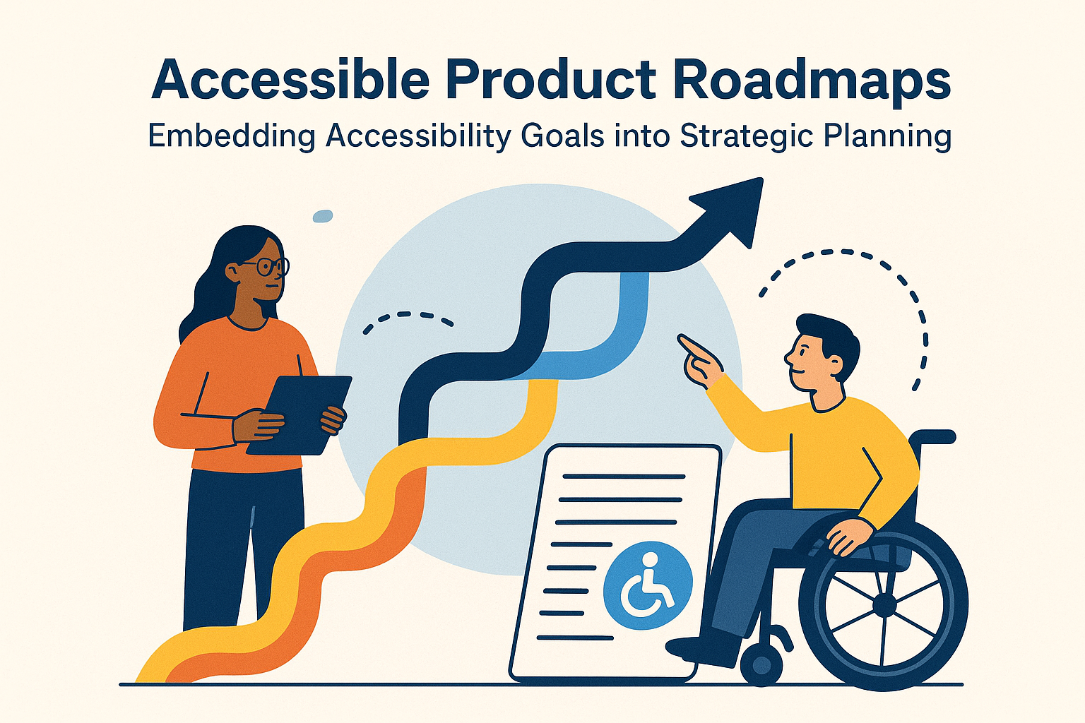

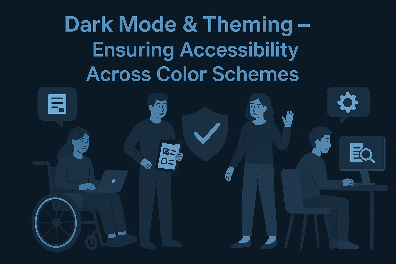
Dark Mode & Theming — Ensuring Accessibility Across Color Schemes
Dark Mode & Theming — Ensuring Accessibility Across Color Schemes
Introduction
Dark mode has evolved from a trend into a user expectation. Many users enable dark mode for aesthetics, reduced glare, or energy savings — and users with light sensitivity or visual fatigue often rely on it for accessibility. However, switching themes can inadvertently reduce contrast, break focus visibility, and diminish legibility. Designing accessible themes ensures usability and readability across light, dark, and high-contrast modes for everyone.
This guide explores how to implement accessible color schemes using WCAG 2.2 contrast standards, CSS theming techniques, and user preference media queries.
Why Theming Accessibility Matters
- Many users prefer or require dark themes to reduce eye strain and glare.
- Inaccessible color pairings in dark mode can render text unreadable and controls indistinguishable.
- Maintaining consistent perception across modes helps users maintain orientation and trust.
- Following
prefers-color-schemeensures users’ system-level settings are respected automatically.
Key WCAG Requirements for Theming
Accessible theming follows the same WCAG Success Criteria 1.4.3 (Contrast Minimum) and 1.4.11 (Non‑Text Contrast).
- Regular text: contrast ratio ≥ 4.5:1 against background.
- Large text (≥ 18 pt or 14 pt bold): ratio ≥ 3:1.
- Non‑text elements (icons, borders, interactive controls): ratio ≥ 3:1 with adjacent colors.
:root {
  --color-bg-light: #ffffff;
  --color-text-light: #1a1a1a;
  --color-bg-dark: #121212;
  --color-text-dark: #ededed;
}

@media (prefers-color-scheme: dark) {
  body {
    background-color: var(--color-bg-dark);
    color: var(--color-text-dark);
  }
}
Contrast Challenges with Dark Mode
Designers often reduce contrast in dark themes to create a muted aesthetic, but this can harm visibility for users with low vision or color perception differences.
- Use off‑black backgrounds (e.g.,
#121212) with off‑white text (e.g.,#e0e0e0) for comfort without sacrificing contrast. - Avoid pure black (#000000) and pure white (#ffffff) pairs — they cause halation (blurring at edges due to high contrast on dark screens).
- Test accent and status colors against both light and dark backgrounds to retain meaning.
Accessible Theme Design Process
1. Define a Color Token System
Use design tokens for text, surfaces, and interactive states rather than hardcoding colors. Each token should meet WCAG standards in all modes.
{
  "color": {
    "background": {
      "light": "#FFFFFF",
      "dark": "#121212"
    },
    "text": {
      "light": "#1A1A1A",
      "dark": "#EDEDED"
    },
    "accent": {
      "light": "#0047AB",
      "dark": "#8AB4F8"
    }
  }
}
2. Respect User Preferences
Implement @media (prefers-color-scheme: dark) and light CSS queries to automatically adjust themes to user settings.
3. Support Manual Toggle Options
Provide a visible theme switch (labeled with text and/or ARIA attribute) for users who prefer manual override.
<button
  id="themeToggle"
  aria-label="Toggle between dark and light mode"
>
  Toggle Theme
</button>
Focus & Interactive State Visibility
Buttons, links, and form controls must remain clearly visible under all color schemes.
- Ensure hover and focus states exceed 3:1 contrast against background (WCAG 2.2 SC 1.4.11).
- Prefer distinct visible focus (underline, outline, or color change with contrast variation ≥ 3:1).
- Never remove the default outline without substituting a visible alternative.
a:focus,
button:focus {
  outline: 2px solid var(--theme-accent);
  outline-offset: 3px;
}
Testing Theming Accessibility
Accessibility testing for themes must account for lighting conditions, hardware, and human perception variability.
- Test in both light and dark modes using the WAVE and axe DevTools extensions.
- Evaluate color contrast with tools like WebAIM Contrast Checker.
- Check accessibility across hardware types (OLED, LCD, High Contrast Mode).
- Involve low‑vision and color‑blind users in testing to ensure real‑world legibility.
Common Accessibility Issues
- Insufficient contrast: Text and UI elements too dim in dark mode.
- Hidden focus indicators: Focus states unnoticeable after mode switch.
- Conflicting colors: Brand palette colors fail contrast requirements.
- Images with blended backgrounds: Logos and icons disappear in dark themes.
Best Practices
- Always test both themes before release — dark mode is not automatically accessible.
- Build theme‑agnostic components that inherit from tokens rather than hardcoded colors.
- Document contrast rules in your design system for consistency.
- Provide a high‑contrast mode for users needing stronger distinction beyond standard dark/light themes.
Conclusion
Accessible dark mode and theming bridge style and substance. By planning contrasts, respecting user preferences, and testing for visibility under real conditions, you can deliver a modern, inclusive experience that works across devices and environments. Accessibility‑first theming combines comfort with clarity — helping users see and engage with content their way.
Next Steps: Audit your color tokens for WCAG compliance, implement automatic contrast testing in design QA, and document patterns for accessible theming in your design system.