

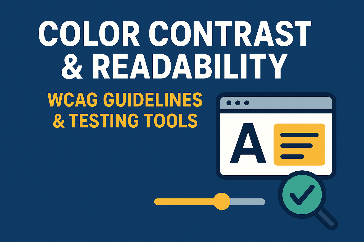
Color Contrast & Readability — WCAG Guidelines & Testing Tools
Color Contrast & Readability: Tools and Guidelines
Introduction
Color contrast and text readability are among the most fundamental aspects of web accessibility. When text does not have sufficient contrast against its background, users with low vision, color blindness, or certain cognitive conditions can struggle to perceive the content. Ensuring adequate contrast and correct font sizing not only improves inclusivity but also strengthens overall usability and design clarity for everyone.
According to the Web Content Accessibility Guidelines (WCAG), proper contrast ratios are a measurable and enforceable standard — and they directly affect whether a digital product meets accessibility compliance levels (A, AA, or AAA).
Why Color Contrast Matters
Color contrast affects how well users can distinguish text, interface components, and interactive elements. The issue is especially impactful for users who:
- Experience low vision or partial sight.
- Have color vision deficiencies such as red-green color blindness.
- View screens in glare, low brightness, or high sunlight conditions.
- Struggle with reading small type or thin fonts.
Even visually appealing designs may be inaccessible if they don't meet minimum contrast thresholds. Accessibility-driven contrast ensures inclusivity without sacrificing brand or aesthetics.
WCAG Contrast Requirements
WCAG 2.2 Contrast Ratios
The contrast ratio measures the luminance difference between two colors — usually between text and background. It’s expressed as a ratio ranging from 1:1 (no contrast) to 21:1 (maximum, e.g., black on white).
- Normal Text (Level AA): Minimum ratio of 4.5:1
- Large Text (18pt or 14pt bold, Level AA): Minimum ratio of 3:1
- UI Components & Graphical Objects: Minimum ratio of 3:1
- Enhanced Contrast (Level AAA):
- Normal Text: 7:1
- Large Text: 4.5:1
Contrast should always be checked against all design states — hover, active, focus, and disabled — and across light/dark themes if applicable.
Readability and Font Considerations
Readability extends far beyond color contrast. To improve legibility:
- Typography: Choose clean, sans-serif, or humanist fonts designed for screen performance. Avoid overly decorative fonts in body copy.
- Font Size: Maintain a base size of at least 16px for paragraphs and allow text resizing without breaking layout.
- Line Height: Set a line height of at least 1.5× the font size.
- Spacing: Provide ample spacing between letters, lines, and paragraphs to prevent fatigue or crowding.
These practices greatly benefit users with dyslexia, low vision, aging eyes, or cognitive fatigue, as well as general audiences.
Tools for Checking Color Contrast
Accessibility tools can streamline contrast evaluation for both designers and developers. Here are some highly recommended options:
- WebAIM Contrast Checker — Simple tool that evaluates color pairs and outputs WCAG conformance ratings.
- Color Contrast Analyzer (TPGi) — Desktop application for assessing color contrast, including gradients and on-screen content.
- WAVE Evaluation Tool — Chrome/Firefox extension that visually highlights insufficient contrast regions.
- Lighthouse Accessibility Audit — Part of Chrome DevTools, it automates accessibility scans including color contrast verification.
- Design Plugins — Tools like Stark, Contrast, and Able integrate directly into Figma, Sketch, and Adobe XD for real‑time color testing.
Always test across multiple devices and different ambient light conditions, especially if your product supports both light and dark themes.
Best Practices for Designers & Developers
- Never rely on color alone to convey meaning — pair color cues with icons, text, or patterns.
- Validate contrast for every state: normal, hover, active, focus, and disabled.
- Check color combinations early during the design phase and again during implementation to avoid regression.
- Adjust brand palette slightly if necessary to meet accessibility thresholds while maintaining identity consistency.
- Document compliant color pairs and typography rules in your design system for organization-wide consistency.
Common Mistakes to Avoid
- Using very light gray or pastel text on white backgrounds.
- Overlaying text directly on busy or high‑contrast images without a solid background layer.
- Failing to test text rendered in hover or disabled states.
- Applying glassmorphism or transparency effects that reduce text/background contrast.
Conclusion
Strong color contrast and legible typography form the foundation of accessible design. By aligning with WCAG contrast thresholds and readability principles, teams ensure that content is perceivable and usable by everyone. This not only meets compliance goals but also enhances overall user experience.
Next steps: Run color audits using contrast tools, refine your design tokens for accessibility, and integrate contrast testing into design and development workflows for long‑term inclusivity.


