
Color Contrast Optimization — Designing for Visual Accessibility
Color Contrast Optimization — Designing for Visual Accessibility
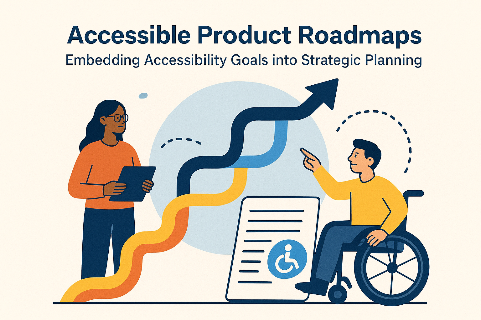
Introduction
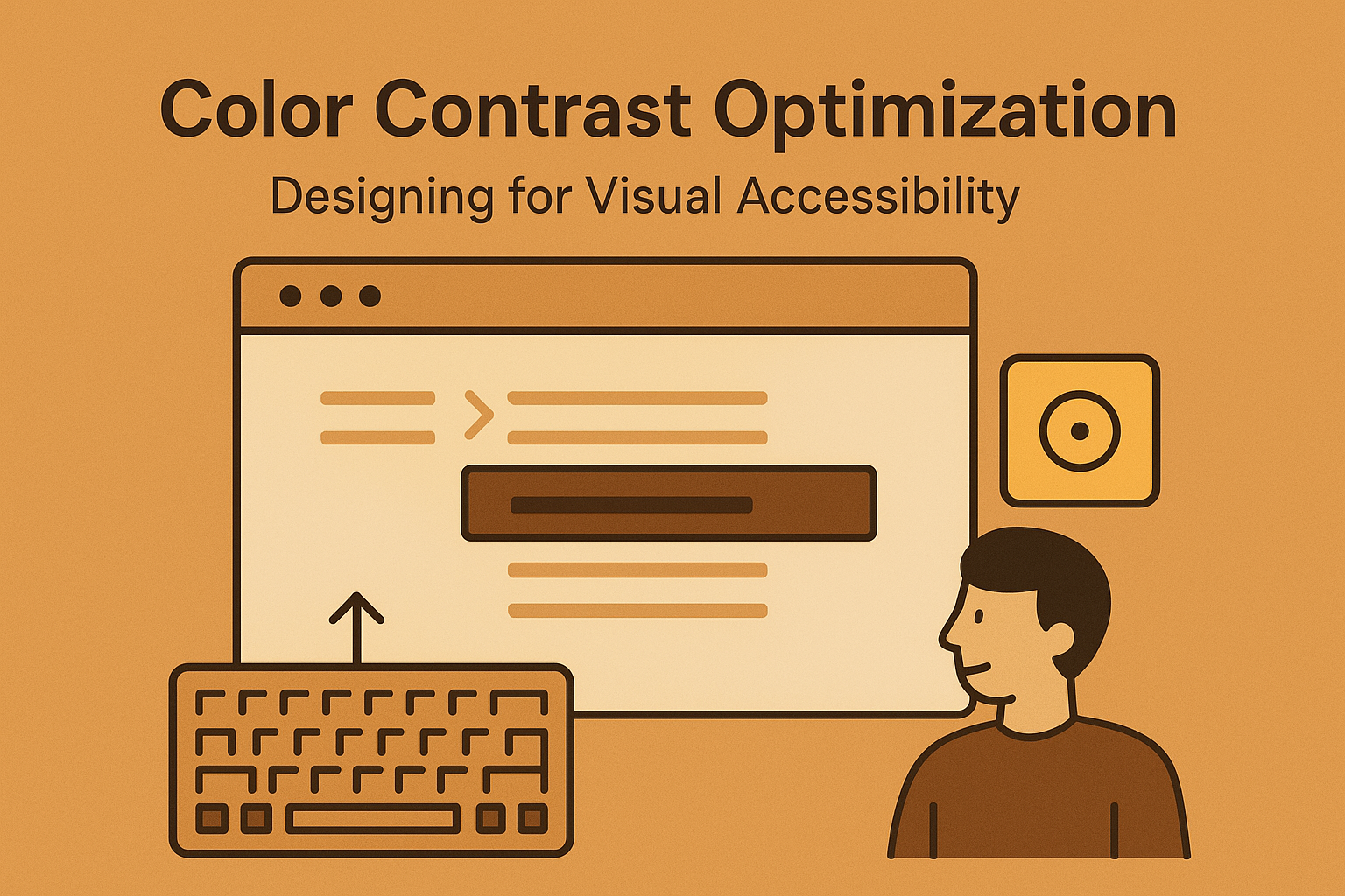
Color is a powerful visual tool — it guides user attention, groups elements, and reflects brand identity. However, poor color contrast is one of the most common accessibility failures on the web. Users with low vision, color blindness, or display limitations may struggle to read or distinguish content. Optimizing color contrast is a cornerstone of inclusive design, ensuring that information remains perceivable regardless of a user’s abilities or device.
WCAG 2.2 Success Criteria 1.4.3 (Contrast Minimum) and 1.4.11 (Non‑Text Contrast) define measurable color contrast ratios for text, icons, and interface components. Understanding and applying these standards ensures legibility for everyone.
Why Color Contrast Matters
- Improves readability for users with low vision or color perception deficiencies.
- Supports visibility in challenging environments, such as glare or poor lighting.
- Enhances aesthetics and focus by establishing visual hierarchy.
- Directly impacts compliance with accessibility laws and WCAG guidelines.
WCAG Color Contrast Requirements
| Content Type | Minimum Contrast Ratio |
|---|---|
| Normal Text | 4.5:1 |
| Large Text (>=24px regular or 18.66px bold) | 3:1 |
| Non‑Text Elements (icons, form controls, graphics) | 3:1 |
Use a color contrast checker to compare foreground and background luminance ratios and adjust values as needed.
Testing Contrast Ratios
Contrast is calculated based on relative luminance values of foreground and background colors. Tools like the following simplify analysis:
For automated auditing, integrate axe Core or Lighthouse accessibility checks into your CI workflow.
Designing Accessible Color Palettes
- Start with contrast: Build palettes that meet WCAG guidelines from the beginning of design.
- Test light/dark themes separately: Ensure contrast holds across all modes and environments.
- Use color plus another cue: Pair color with text, icons, or patterns to convey meaning (e.g., error states).
- Leverage design tokens: Define contrast‑tested variables for consistency across products.
:root {
  --color-primary: #005fcc;
  --color-primary-text: #ffffff;
  --color-error: #e60023;
  --color-success: #00875a;
}
Simulating Color Vision Deficiencies
Roughly 8% of men and 1% of women experience some form of color blindness. Simulate different types of color vision to ensure clarity and usability across all variations.
- Deuteranopia: Reduced green sensitivity.
- Protanopia: Reduced red sensitivity.
- Tritanopia: Reduced blue sensitivity.
Use browser extensions or design tools like:
Accessible Use of Color in UI
- Don’t rely solely on color to indicate state — always include a text label or icon.
- Keep sufficient contrast between text and background, even on images or gradients.
- Provide hover or focus indicators that differ by more than color alone (e.g., underline and color change).
- Use patterns, opacity, or borders when displaying disabled or selected states.
Common Color Contrast Pitfalls
- Minimal contrast between link and surrounding text: Users can’t distinguish clickable elements.
- Low contrast in light themes: Gray or pastel text fades against white backgrounds.
- Overuse of brand colors: Aesthetic choices override readability.
- Neglecting hover/focus states: State changes might fail minimum contrast ratios.
Testing in Real Conditions
Beyond numeric contrast validation, evaluate readability under practical conditions:
- Review designs in both light and dark themes.
- Check displays on different devices and lighting environments.
- Involve users with low vision in usability sessions.
Conclusion
Color contrast optimization turns design into communication — ensuring clarity and equity for every user. Following WCAG color standards improves readability, perception, and focus without sacrificing style. Accessibility and beautiful design go hand in hand when contrast drives creativity.
Next Steps: Evaluate your product’s palettes for WCAG compliance, introduce automated color contrast testing into design workflows, and document approved combinations in your design system.