

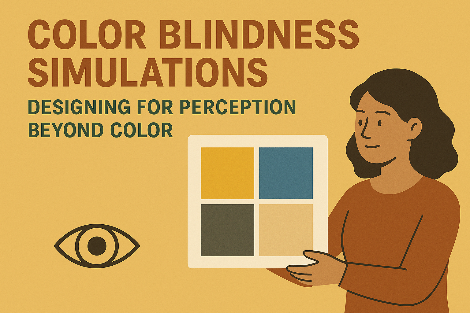
Color Blindness Simulations — Designing for Perception Beyond Color
Color Blindness Simulations — Designing for Perception Beyond Color
Introduction
Color is an essential element of digital design — it conveys meaning, hierarchy, and emotion. But for millions of users with color vision deficiencies, color‑based communication can create barriers to clarity and usability. Color blindness simulations help designers visualize interfaces the way color‑blind users experience them, revealing overlooked accessibility gaps.
This article explores how to integrate color blindness simulation tools and inclusive color strategies to ensure that all users perceive and interact with your designs effectively.
Why Designing Beyond Color Matters
- Roughly 1 in 12 men and 1 in 200 women worldwide have some form of color vision deficiency.
- Reliance on color alone can make critical information — warnings, charts, or status indicators — unreadable for some users.
- Inclusive color design improves clarity for everyone, not only those with color blindness.
- Color‑independent design reduces risk in compliance with WCAG 2.2 Success Criterion 1.4.1: Use of Color.
Core Simulation and Design Considerations
1. Types of Color Vision Deficiencies
- Protanopia / Protanomaly: Difficulty perceiving red light.
- Deuteranopia / Deuteranomaly: Difficulty perceiving green light.
- Tritanopia / Tritanomaly: Difficulty perceiving blue light.
- Monochromacy: Seeing the world in shades of gray.
2. Simulation Tools and Plugins
- Sim Daltonism: macOS simulation overlay for prototypes or interfaces.
- Color Oracle: Real‑time desktop simulator for multiple vision types.
- Stark / Figma / Adobe XD Plugins: Integrated design tool simulations and color contrast checkers.
- Chrome DevTools: Built‑in rendering options for protanopia, deuteranopia, and tritanopia.
3. Design Adaptation Strategies
- Use redundant indicators — text labels, icons, patterns, or borders — alongside color.
- Maintain sufficient contrast between adjacent elements (contrast ratio ≥ 3:1 for informative graphics).
- Test data visualizations with alternative palettes that remain distinguishable under simulation.
- Provide user‑selectable themes or high‑contrast modes for greater personalization.
Building Color‑Inclusive Design Workflows
Step 1: Integrate Simulation Early
Run color blindness simulations during initial wireframing or design critique stages to flag risky color dependencies before development begins.
Step 2: Document Accessible Color Tokens
- Define brand color variables with minimum contrast standards (WCAG AA or higher).
- Include alternate palette versions validated through simulation.
- Provide color usage guidelines in your design system documentation.
Step 3: Validate with Real Users
Whenever possible, conduct usability testing with participants who have different forms of color blindness to confirm that comprehension and task success remain consistent.
Step 4: Automate Checks in Dev and QA
- Integrate automated color contrast testing into CI/CD flows using tools like
axeorPa11y. - Include visual regression testing that accounts for color variations and simulation snapshots.
Recommended Color Accessibility Metrics Framework
| Metric | Data Source | Frequency | Goal / Benchmark |
|---|---|---|---|
| Color Contrast Compliance Rate | Automated Testing Tools | Continuous Integration | > 98% WCAG AA pass rate |
| Design System Color Tokens Validated | Design System Audit | Quarterly | 100% tokens simulate accessibly |
| Simulation Coverage Across Products | Design Review Logs | Per Release | > 90% of new designs tested |
| User Feedback on Color Perception | Accessibility Surveys / Usability Tests | Bi‑Annually | ≥ 4.5 / 5 satisfaction score |
Integrating Simulations Across Teams
1. Design Team
Designers incorporate simulations directly into design files and presentations. During reviews, a quick toggle between normal and simulated color vision ensures universal legibility.
2. Development Team
Developers verify color tokens in code and ensure accessible contrast ratios render correctly in production environments. Automated pipelines flag color contrast regressions.
3. QA and Accessibility Review
- QA includes color simulation snapshots in accessibility testing reports.
- Accessibility leads approve final palettes and communicate issues with design and development teams.
Common Pitfalls
- Overreliance on brand colors: Tight branding control can overshadow accessibility needs.
- Ignoring non‑text elements: Icons, charts, and maps often fail color contrast independently from text.
- No simulation in review: Designs move to production without being tested under color‑blind conditions.
- Color‑only communication: Using color alone to convey success, error, or progress information.
Best Practices for Sustainable Color Accessibility
- Always provide multiple visual cues — icons, labels, or text — in addition to color.
- Include simulation results during design system audits and accessibility compliance reports.
- Test across multiple environments (light/dark mode, large displays, mobile) to maintain accessible contrast consistency.
- Educate all design contributors on color vision diversity and perception differences.
Conclusion
Color blindness simulations are powerful empathy tools that help designers see through the eyes of users with different visual perceptions. When used consistently, they not only detect accessibility issues but also cultivate a mindset of inclusive communication and universal clarity. Designing for perception beyond color ensures that meaning, feedback, and hierarchy remain visible to everyone — regardless of how they see the world.
Next Steps: Integrate simulation plugins into your design workflow, document inclusive color tokens, and regularly test your interfaces under simulated color vision conditions to create truly inclusive visual experiences.


