

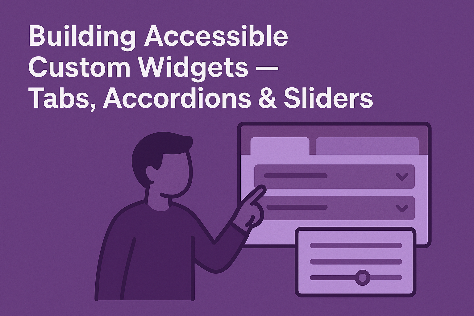
Building Accessible Custom Widgets — Tabs, Accordions & Sliders
Building Accessible Custom Widgets — Tabs, Accordions & Sliders
Introduction
Modern web applications often require custom interactive components such as tabs, accordions, and sliders. While these controls enhance user experience visually, they can easily break accessibility if not implemented correctly. By applying semantic HTML, ARIA roles, and predictable keyboard navigation, you can make custom UI widgets fully operable for all users — including those relying on assistive technologies.
Why Accessibility for Custom Widgets Matters
Custom components simulate native HTML behavior (like buttons and inputs) but do not inherit accessibility features automatically. Without explicit coding support:
- Screen reader users can’t understand relationships between content sections.
- Keyboard users can’t activate or navigate through interactive elements.
- Dynamic states (expanded, collapsed, selected) are unavailable to assistive technologies.
WCAG 2.2 guidelines, particularly Success Criterion 4.1.2 (Name, Role, Value), mandate that UI components clearly expose their roles and states to ensure inclusivity.
Accessible Tabs
Tabs group related panels of content, helping users easily switch between sections. Each tab must be focusable, operable by keyboard, and linked to its corresponding panel via appropriate ARIA attributes.
HTML Structure & ARIA Roles
<div role="tablist" aria-label="Sample Tabs">
  <button role="tab" aria-controls="panel1" aria-selected="true">Overview</button>
  <button role="tab" aria-controls="panel2" aria-selected="false">Details</button>
</div>

<div id="panel1" role="tabpanel">
  <p>Overview content goes here.</p>
</div>
<div id="panel2" role="tabpanel" hidden>
  <p>Detailed content goes here.</p>
</div>
Keyboard Interaction Requirements
- Tab — moves focus into the tab list.
- Arrow Right/Left — moves between tabs.
- Enter or Space — activates the focused tab.
Accessibility Best Practices
- Use
aria-selectedto indicate which tab is active. - Hide inactive panels using
hiddenoraria-hidden="true". - Keep focus on the active tab button for consistent navigation.
Accessible Accordions
Accordions show and hide content sections dynamically. Each toggle should behave like a button with proper ARIA state management.
Example Structure
<div class="accordion">
  <h3>
    <button aria-expanded="false" aria-controls="content1">Section 1</button>
  </h3>
  <div id="content1" hidden>
    <p>Accordion content for section 1.</p>
  </div>
</div>
ARIA and Keyboard Support
- Set
aria-expanded="true"when a section is opened. - Use the
EnterorSpacekey to toggle sections. - Optionally add arrow key navigation for multi-accordion lists.
This model ensures that users of screen readers, keyboards, or speech recognition tools understand which panel is active or hidden.
Accessible Sliders
Sliders are interactive components used for adjusting values such as volume or brightness. Accessibility ensures that sliders are usable via both pointer and keyboard input.
Basic ARIA Slider Example
<input
  type="range"
  id="volume"
  min="0"
  max="100"
  value="50"
  aria-valuemin="0"
  aria-valuemax="100"
  aria-valuenow="50"
  aria-label="Volume"
/>
Keyboard Interaction
- Left/Down Arrow — decrease value.
- Right/Up Arrow — increase value.
- Home — minimum value.
- End — maximum value.
Best Practices
- Provide visual feedback (numeric or percentage) alongside the slider.
- Announce updates using
aria-valuenowfor assistive technology. - Ensure focus styles are visible when the slider is active.
Testing Your Widgets
To ensure accessibility compliance:
- Navigate with keyboard only; confirm that focus order and functionality are logical.
- Inspect ARIA attributes using browser accessibility tools or Chrome DevTools.
- Use a screen reader to validate announcements (NVDA, VoiceOver, or JAWS).
- Run automated checks with axe DevTools or WAVE.
Common Accessibility Mistakes
- Missing roles: Without ARIA markup, elements lack semantic meaning.
- Incorrect key mapping: Using non-standard keyboard shortcuts confuses users.
- Invisible focus: Removing outlines makes navigation impossible for keyboard users.
- Incorrect state management: Forgetting to toggle
aria-expandedoraria-selectedcreates inconsistent experiences.
Conclusion
Accessible widgets are the foundation of inclusive web applications. By following ARIA best practices, maintaining keyboard support, and ensuring visible focus, you can transform your custom tabs, accordions, and sliders into robust, WCAG‑compliant components that every user can operate seamlessly.
Next Steps: Review your UI components for proper ARIA roles and keyboard functionality. Refactor or replace non-compliant patterns and document your accessibility approach as part of your design system.


