

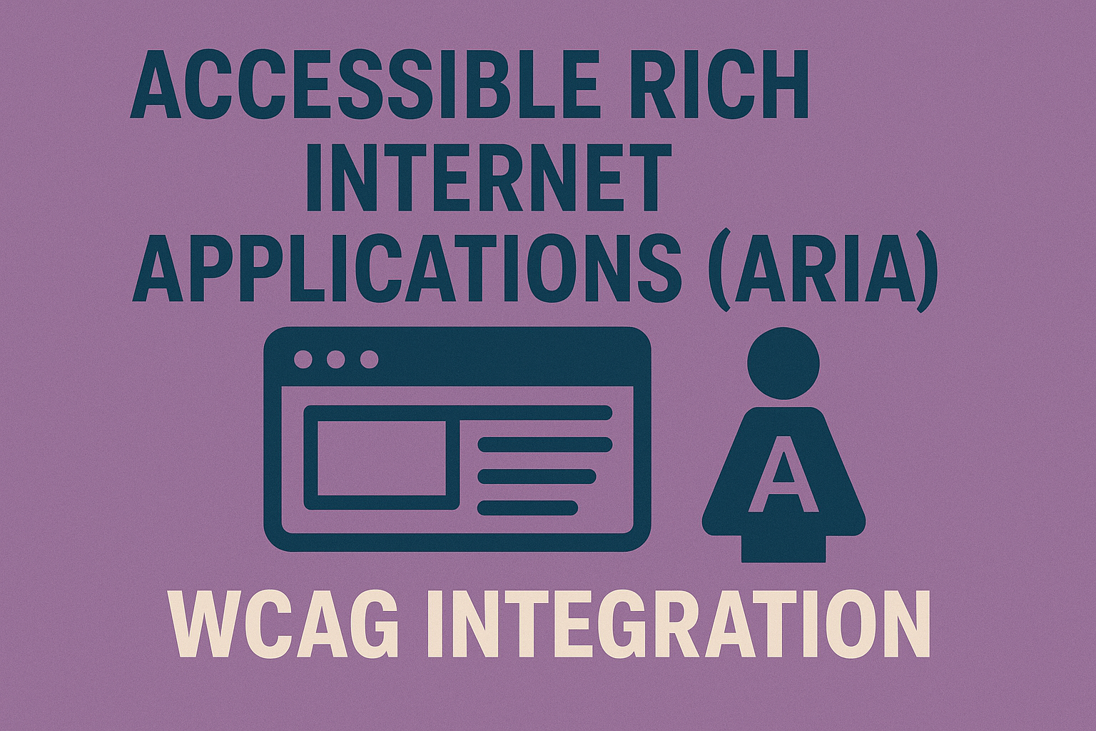
Accessible Rich Internet Applications (ARIA) & WCAG Integration
Accessible Rich Internet Applications (ARIA) & WCAG Integration
Introduction
Modern websites rely heavily on dynamic JavaScript frameworks, custom widgets, and asynchronous content updates. While these enhance interactivity, they also risk breaking accessibility when semantic information and programmatic relationships are not correctly exposed.
The WAI‑ARIA (Web Accessibility Initiative — Accessible Rich Internet Applications) specification provides a standardized way to communicate component roles, states, and properties to assistive technologies. When used alongside the Web Content Accessibility Guidelines (WCAG), ARIA bridges the gap between static HTML semantics and complex, script‑driven behaviors.
This article explains how ARIA fits within WCAG, outlines core ARIA attributes, and offers reliable implementation techniques for custom components that satisfy accessibility conformance levels.
Why ARIA Matters
Native HTML controls (buttons, links, inputs) already include semantic meaning and keyboard interaction patterns built into browsers. However, today's web often requires custom components — think dropdown menus, accordions, modals, carousels, tab panels, or virtual lists — that go beyond native behavior.
Without explicit semantic information, assistive technologies such as screen readers cannot identify how to interact with these widgets. WAI‑ARIA ensures that every user, regardless of device or disability, can understand an element’s purpose, status, and relation to other content.
Core WCAG Principles Supported by ARIA
- Perceivable: ARIA labels and roles make dynamic interface elements discoverable.
- Operable: ARIA controls reinforce keyboard accessibility and help prevent focus loss in custom components.
- Understandable: Status indicators like
aria-liveoraria-expandedcommunicate contextual change clearly. - Robust: Assistive technology interoperability ensures consistent interpretation across devices.
ARIA does not replace WCAG requirements but supports them when HTML alone is insufficient.
Fundamental ARIA Roles
ARIA introduces a role taxonomy describing an element’s purpose. Adding a role communicates how an element behaves and how users should operate it.
- role="button" — Defines clickable functionality when not using a native
<button>. - role="dialog" — Marks modal or pop‑up regions requiring focus management.
- role="navigation" — Groups major navigation lists for screen reader quick‑jump lists.
- role="tablist" — Container for related
role="tab"androle="tabpanel"pairs. - role="alert" — Delivers immediate, polite notifications.
<div role="button" tabindex="0">Show more details</div>
Key ARIA Attributes
ARIA uses attributes to describe state, relationship, and dynamic behavior of content. Some essential patterns include:
- aria-label — Provides an explicit accessible name when visible text is missing.
- aria-labelledby — Associates an element with another element’s text label.
- aria-describedby — Links an element to supplementary description text.
- aria-expanded — Indicates whether a collapsible section or menu is open or closed.
- aria-checked — Represents selected state of toggles or custom checkboxes.
- aria-hidden — Hides elements from assistive technology when off‑screen or visually muted.
- aria-live — Announces real‑time updates to users when content changes dynamically.
<button aria-expanded="false" aria-controls="panel">More options</button>
<div id="panel" hidden>Expanded content...</div>
ARIA and Keyboard Interaction
WCAG’s Operable pillar depends on robust keyboard support. ARIA attributes alone are not enough; developers must implement logical tab flow and meaningful focus handling to reinforce behavior.
- Use
tabindex="0"to place custom elements in the natural focus order. - Apply
tabindex="-1"when programmatic focus is required without making an element tab‑stop‑visible. - Capture key events (
Space,Enter,Arrow keys) to simulate native control actions.
// JavaScript example for a custom accordion heading
heading.addEventListener('keydown', e => {
  if (e.key === 'Enter' || e.key === ' ') {
    toggleAccordion();
  }
});
Live Regions and Dynamic Updates
Interfaces change constantly — notifications, chat messages, validation feedback. Without cues, screen readers won’t announce these updates.
WCAG 2.2 (Success Criterion 4.1.3 Status Messages) requires mechanisms to inform users when content updates without moving focus. The ARIA aria-live attribute satisfies this by letting developers mark regions for automatic announcements.
<div aria-live="polite">Loading results...</div>
Use aria-live="polite" for non‑urgent changes and aria-live="assertive" for critical alerts like errors or timeouts. Pair with role="status" or role="alert" for maximum compatibility.
Best Practices for Using ARIA with WCAG
- Use native HTML first: prefer semantic tags like
<button>or<nav>. ARIA should either enhance or fill gaps when no native markup exists. - Never change semantics incorrectly: setting
role="button"on a heading misleads assistive technologies. - Keep names consistent: the visible label and ARIA name must match to support voice control systems.
- Validate structure: ensure required parent‑child relationships, such as each
role="menuitem"existing inside arole="menu". - Avoid redundant aria‑hidden="true": hiding elements while also removing them visually may cause double exclusion or fragmentation of reading order.
Examples of ARIA Integration by Component
Accordion
<button class="accordion-header" aria-expanded="false" aria-controls="acc1">
  Show details
</button>
<div id="acc1" role="region" hidden>
  Content inside accordion.
</div>
Modal Dialog
<div role="dialog" aria-modal="true" aria-labelledby="modaltitle">
  <h2 id="modaltitle">Dialog heading</h2>
  <button>Close</button>
</div>
Tabs
<div role="tablist">
  <button role="tab" aria-controls="panel1" aria-selected="true">Overview</button>
  <button role="tab" aria-controls="panel2">Specifications</button>
</div>
<div id="panel1" role="tabpanel">Tab one content</div>
<div id="panel2" role="tabpanel" hidden>Tab two content</div>
Error Prevention and Validation Feedback
Custom validation messages must be programmatically exposed so assistive technologies can announce them directly. Use role="alert" or aria-live inside forms to satisfy WCAG success criteria 3.3.1 (Error Identification) and 3.3.3 (Error Suggestion).
<input id="email" aria-describedby="err-email">
<span id="err-email" role="alert">Please provide a valid email address.</span>
Testing ARIA Implementation
Testing is critical because ARIA influences non‑visual output rather than visual appearance. To verify correct integration:
- Use a screen reader (NVDA, VoiceOver, JAWS) to navigate and confirm announced roles and relationships
- Activate and collapse interactive elements using only keyboard keys.
- Inspect accessibility tree output through browser developer tools to ensure roles and states appear.
- Validate your markup using W3C HTML Validator and axe ruleset.
Common ARIA Mistakes
- Using ARIA where native HTML works perfectly, creating confusion.
- Omitting keyboard logic; ARIA does not automatically add keyboard support.
- Forgetting to toggle
aria-expandedoraria-checkedwhen states change. - Suppressing focus inside
role="dialog"without returning it to the trigger element afterward.
Keeping ARIA Future‑Proof
Browser and assistive technology support continues to improve. Stay consistent with the latest W3C ARIA specification and WCAG 2.2 Quick Reference. As WCAG 3.0 arrives, the principles of semantic meaning and device independence will remain foundation stones of inclusive design.
Conclusion
Integrating ARIA with WCAG creates robust, accessible interfaces that communicate equally well with humans and machines. When implemented correctly — using native HTML first, supplementing with accurate roles, and maintaining dynamic states — ARIA transforms complex web apps into inclusive experiences usable with keyboards, screen readers, and voice interfaces alike.
Next steps: Audit your site's interactive elements. Replace custom JavaScript widgets with ARIA‑enhanced patterns verified for keyboard, contrast, and focus behavior. Run screen‑reader tests after each major UI update to ensure continuous WCAG compliance.


