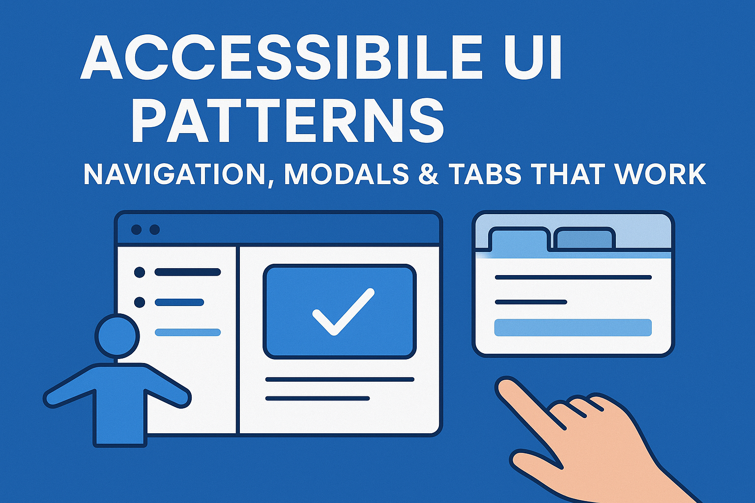
Accessible UI Patterns — Navigation, Modals & Tabs That Work
Accessible UI Patterns: Navigation, Modals & Tabs
Introduction
User interface patterns—like navigation menus, modals, and tab panels—are key elements that shape the way users interact with digital products. Unfortunately, these components are also where accessibility barriers most often occur. Poorly designed navigation can confuse screen reader users; inaccessible modals can trap focus; and improperly built tab panels can become unusable for keyboard navigation.
This guide explores common UI patterns and outlines how to implement them accessibly using WCAG 2.2 principles, semantic HTML, and ARIA best practices. Accessible patterns create predictable, consistent, and inclusive user experiences for everyone.
Accessible Navigation Patterns
1. Skip Links
A skip link lets users bypass repetitive content such as navigation menus and jump directly to the main page area. It typically appears as the first interactive element on the page but only becomes visible when focused.
<a href="#main-content" class="skip-link">Skip to main content</a>
This approach improves efficiency for keyboard and screen reader navigation, fulfilling WCAG 2.4.1 Bypass Blocks.
2. Landmark Roles
Use HTML5 landmarks or ARIA roles to define key regions:
<header>orrole="banner"— Page header.<nav>orrole="navigation"— Navigation section.<main>orrole="main"— Main content area.<footer>orrole="contentinfo"— Footer information.
Screen readers can jump quickly between landmarks, enabling faster orientation and comprehension.
3. Keyboard Navigation
All navigation links and dropdown menus must be fully operable via keyboard. Use the Tab and Shift + Tab keys to move through items and Enter or Space to activate links. Maintain a visible focus indicator on all interactive elements.
Accessible Modal Dialogs
1. Proper Semantics and ARIA Roles
A modal or dialog box should announce itself to assistive technology users. Use a semantic structure and appropriate attributes:
<div role="dialog" aria-labelledby="dialogTitle" aria-modal="true">
  <h2 id="dialogTitle">Sign Up</h2>
  <p>Fill in your details to register an account.</p>
</div>
Setting aria-modal="true" ensures that background content is not accessible to screen readers while the modal is open.
2. Focus Management
When a modal opens, move focus to its first interactive element (often the heading or the first input). When it closes, return focus to the element that triggered it. This control supports WCAG 2.4.3 Focus Order.
3. Keyboard Controls
- Tab: Moves forward through elements within the modal.
- Shift + Tab: Moves focus backward.
- Esc: Closes the modal.
Use JavaScript to trap focus within the modal while open. This prevents users from navigating off the dialog using Tab.
4. Visual & Motion Considerations
Ensure modals meet color‑contrast requirements and avoid abrupt animations. If transitions are used, honor the system’s prefers-reduced-motion setting.
Accessible Tabs & Accordions
1. Semantic Structure
Tabs allow users to switch between related sections of content. Use markup and ARIA attributes that define relationships clearly:
<div role="tablist" aria-label="Information Sections">
  <button role="tab" aria-controls="panel1" aria-selected="true" id="tab1">Details</button>
  <button role="tab" aria-controls="panel2" aria-selected="false" id="tab2">Reviews</button>
</div>

<div role="tabpanel" id="panel1" aria-labelledby="tab1">
  <p>Product details content here.</p>
</div>
<div role="tabpanel" id="panel2" aria-labelledby="tab2" hidden>
  <p>User reviews content here.</p>
</div>
This establishes correct keyboard navigation and labeling between tabs and panels.
2. Keyboard Interaction
- Tab: Moves between tabs and out of the tab list.
- Left/Right Arrows: Switch between tabs.
- Enter or Space: Activates the selected tab and displays its panel.
3. Accordion Best Practices
- Each collapsible heading should use a button element for toggling.
- Use
aria-expandedto indicate the open/closed state. - Associate headings and panels with
aria-controlsand unique IDs. - Animate transitions smoothly while respecting reduced‑motion settings.
Testing & Validation
Test all UI patterns with both keyboard and screen readers. Verify:
- Focus order follows visual order.
- Tabbing never skips or traps users.
- All controls announce their current state (open, closed, selected).
- Contrast and font sizes meet WCAG AA thresholds.
Use tools such as Accessibility Insights or WAVE to validate structural patterns.
Common Mistakes
Creating custom modals without focus control or ARIA roles.
- Misusing divs for tabs or buttons instead of semantic elements.
- Trapping users behind hidden overlays that block navigation.
- Using animation for tab content changes without accessible alternatives.
Best Practices Summary
Start with native HTML elements wherever possible.
- Keep navigation predictable and provide skip links.
- Maintain correct ARIA relationships among interactive components.
- Always manage focus transitions explicitly for modals and tabs.
- Test UI patterns manually with screen readers and keyboard navigation.
Conclusion
Accessible UI patterns empower users to navigate and interact efficiently across devices and contexts. By aligning navigation structures, modals, and tabs with WCAG 2.2 and ARIA Authoring Practices, teams reduce user frustration, ensure compliance, and provide a smooth experience for everyone.
Next steps: Review your existing UI components for accessibility gaps, apply ARIA and semantic structure where appropriate, and integrate accessibility testing into your design system’s component library to standardize inclusive interfaces.


