

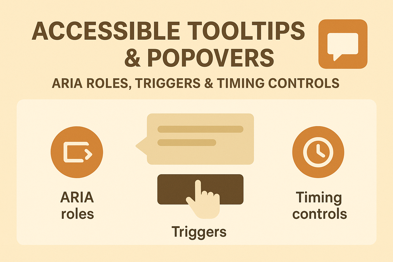
Accessible Tooltips & Popovers — ARIA Roles, Triggers & Timing Controls
Accessible Tooltips & Popovers — ARIA Roles, Triggers & Timing Controls
Introduction
Tooltips and popovers are small interface elements that display additional information when users hover, focus, or click on elements. While visually helpful, many implementations rely entirely on mouse interactions or contain timing issues that make them unusable for keyboard and screen reader users. Accessibility ensures that contextual hints, definitions, and supporting notes are perceivable and controllable for everyone.
This guide explains how to create WCAG-compliant tooltips and popovers using proper ARIA attributes, focus management, and consistent triggering behavior.
Why Accessible Tooltips Matter
- Users with mobility impairments must access tooltips via keyboard and touch, not just mouse hover.
- Screen readers require programmatically associated content to announce help text clearly.
- Proper timing and visibility management prevent tooltips from disappearing too fast or overlapping critical content.
ARIA Roles and Relationships
Use ARIA attributes to establish clear relationships between the tooltip trigger and the tooltip content:
<button aria-describedby="tip1">Info</button>
<div role="tooltip" id="tip1">
  Click this button for more information.
</div>
- aria-describedby connects the tooltip to its trigger.
- role="tooltip" identifies the element as a tooltip to assistive technologies.
Keep the tooltip content in the DOM at all times, toggling visibility through CSS or JavaScript rather than adding/removing nodes dynamically.
Trigger Options & Keyboard Support
Tooltips must be accessible through multiple interactions:
- Mouse hover for sighted users.
- Keyboard focus for users tabbing through controls.
- Touch or click where applicable (especially mobile).
Example approach using keyboard focus:
<button
  aria-describedby="tip2"
  onfocus="showTooltip()"
  onblur="hideTooltip()"
>
  Help
</button>
<div role="tooltip" id="tip2" hidden>
  Enter your username. It must be unique.
</div>
Managing Visibility and Timing
Tooltips should follow WCAG’s Success Criterion 1.4.13 (Content on Hover or Focus): users must be able to dismiss or hover tooltips easily without unwanted disappearance.
- Keep the tooltip visible as long as the trigger or tooltip itself is hovered or focused.
- Provide a delay buffer (around 300–500 ms) before hiding to prevent jittering.
- Never require precise pointer control to interact.
let tooltip;
function showTooltip() {
  tooltip = document.getElementById('tip2');
  tooltip.removeAttribute('hidden');
}
function hideTooltip() {
  setTimeout(() => tooltip.setAttribute('hidden', true), 400);
}
Popovers and Focus Management
Popovers behave similarly to tooltips but contain richer interactive content (e.g., menus or forms). Assign role="dialog" or role="menu" depending on use, and ensure focus moves into the popover when it appears.
<button aria-haspopup="dialog" aria-expanded="false" id="popoverButton">Details</button>
<div role="dialog" aria-modal="false" aria-labelledby="popoverTitle" hidden>
  <h2 id="popoverTitle">Feature Details</h2>
  <p>Additional info about this feature.</p>
</div>
Return focus to the trigger after the popover closes.
Best Practices for Accessible Tooltips
- Ensure tooltips complement but never duplicate link text or button labels.
- Position tooltips without covering triggering elements or critical interface areas.
- Use visible indicators (icons or underlines) to show where tooltips exist.
- Allow dismissal using Esc or by moving focus away from the trigger.
- Keep tooltip text short and contextual — ideally under two sentences.
Common Accessibility Issues
- Hover-only activation: Excludes keyboard and touch users.
- Tooltips that vanish instantly: Violates WCAG 1.4.13 timing expectations.
- Dynamic insertion/removal: Causes screen readers to miss announcements.
- Overlapping tooltip placement: Blocks essential content underneath.
Testing Tooltips & Popovers
Validate accessibility both visually and programmatically:
- Tab to each trigger and ensure tooltip content becomes visible and readable.
- Check that screen readers announce tooltip descriptions correctly through
aria-describedby. - Use WAVE or axe DevTools to validate semantic relationships.
- Test timing, dismissal, and re-entry using both mouse and keyboard navigation.
Conclusion
Accessible tooltips and popovers enhance understanding without creating barriers. Proper ARIA labeling, focus management, and timing control make contextual help usable for everyone. When implemented correctly, accessibility transforms subtle interface details into empowering guidance for all users.
Next Steps: Review your help tips and popovers for hover-only activation, ensure proper aria-describedby relationships, and validate timing consistency across devices for WCAG compliance.


