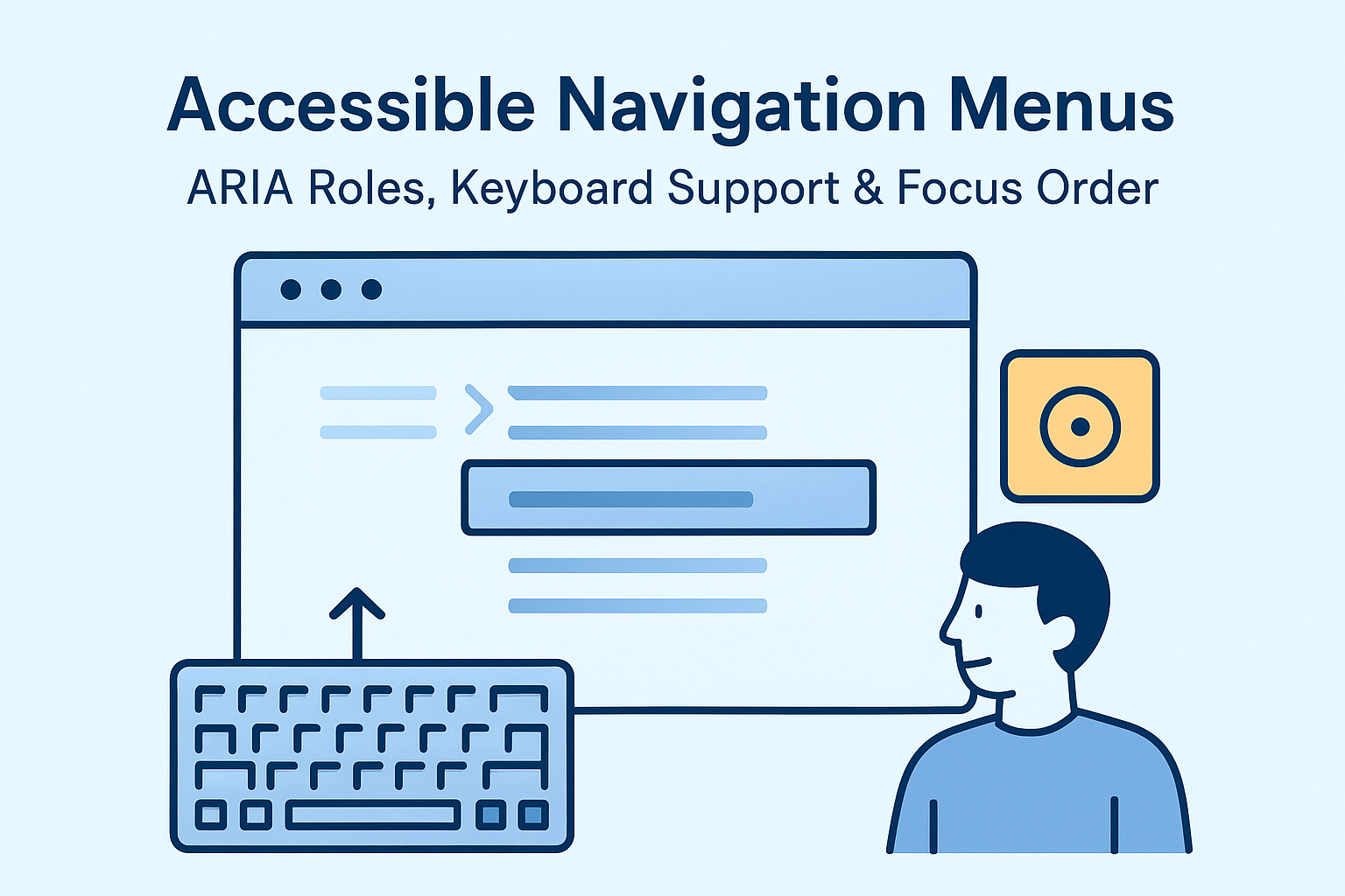
Accessible Navigation Menus — ARIA Roles, Keyboard Support & Focus Order
Accessible Navigation Menus — ARIA Roles, Keyboard Support & Focus Order
Introduction
Navigation menus are the backbone of user experience and information architecture. However, complex dropdowns, hidden states, and inconsistent keyboard behavior can quickly make navigation unusable for people relying on assistive technologies. Accessible navigation ensures everyone can find, understand, and use site menus efficiently — whether using a mouse, keyboard, or screen reader.
This guide outlines how to structure, label, and manage navigation elements following WCAG 2.2 Success Criteria 2.4.1 (Bypass Blocks), 2.4.3 (Focus Order), and 2.1.1 (Keyboard).
Why Navigation Accessibility Matters
Navigation menus are typically the first and most frequently used areas of a website. Ensuring equal access improves usability and orientation for everyone.
- Users with mobility and vision impairments rely on structured, predictable navigation.
- Screen readers depend on semantic labels, focus order, and ARIA landmarks to interpret menus.
- Properly tagged menus enhance SEO and overall content discoverability.
Semantic Structure of Navigation
Always start with semantic HTML elements. Wrap your main navigation in a <nav> element with a descriptive label:
<nav aria-label="Main Navigation">
  <ul>
    <li><a href="/home">Home</a></li>
    <li><a href="/about">About</a></li>
    <li><a href="/services">Services</a></li>
    <li><a href="/contact">Contact</a></li>
  </ul>
</nav>
This structure allows screen readers to identify the section as navigation immediately.
Accessible Dropdown Menus
Dropdown or mega menus should open and close via both mouse and keyboard. Use ARIA roles and attributes to indicate their state and control relationships.
<nav aria-label="Main menu">
  <ul role="menubar">
    <li role="none">
      <button aria-haspopup="true" aria-expanded="false">Products</button>
      <ul role="menu" hidden>
        <li role="none"><a role="menuitem" href="/software">Software</a></li>
        <li role="none"><a role="menuitem" href="/hardware">Hardware</a></li>
      </ul>
    </li>
  </ul>
</nav>
- aria-haspopup – Indicates the button opens a submenu.
- aria-expanded – Communicates current open/closed state.
- role="menu" / "menuitem" – Defines proper relationships for screen readers.
Keyboard Navigation Behavior
Navigation must be fully accessible without a mouse:
- Tab – Moves between top-level menu items.
- Enter or Space – Opens submenu.
- Esc – Closes current submenu and returns focus to the trigger.
- Arrow Keys – Navigate between submenu items.
// Example JavaScript for keyboard interaction
menuButton.addEventListener('keydown', e => {
  if (e.key === 'Enter' || e.key === ' ') {
    toggleSubmenu();
  }
  if (e.key === 'Escape') {
    closeSubmenu();
    menuButton.focus();
  }
});
Managing Focus Order
When opening submenus, focus management ensures orientation and prevents confusion:
- Move focus into the dropdown once opened using
element.focus(). - Return focus to the menu trigger when closing (
aria-expanded="false"). - Keep a logical tab order consistent with visual layout.
Use visually discernible focus indicators to show the current selection.
Skip Navigation Links
Long pages can frustrate keyboard and screen reader users who must repeatedly tab through menus. Implement a “skip to main content” link at the top of your page.
<a href="#main-content" class="skip-link">Skip to main content</a>
Make sure the link becomes visible when focused.
Testing Navigation Accessibility
To validate accessibility and usability:
- Navigate only with Tab and Shift + Tab.
- Test with a screen reader to ensure items are announced correctly (e.g., “submenu expanded”).
- Use automated tools like WAVE or axe DevTools to detect missing attributes.
- Ensure consistent behavior across devices and browsers.
Common Navigation Accessibility Mistakes
- Hover-only dropdowns: Submenus open only on mouse hover, leaving keyboard users stranded.
- Focus lost when closing menus: Returning focus to unexpected elements disorients users.
- Incorrect ARIA markup: “role=menu” applied without proper hierarchy confuses assistive tech.
- Missing visible focus: Without clear outlines, users can’t tell where they are.
Conclusion
Accessible navigation transforms site usability and structure into a truly inclusive experience. By implementing proper roles, predictable keyboard support, and focus order, you ensure equal access for all users and align with WCAG 2.2 guidelines. Inclusive navigation is not just good practice — it’s good design.
Next Steps: Review your navigation menus, verify logical tab order, and test ARIA implementations across multiple devices and assistive technologies.


