

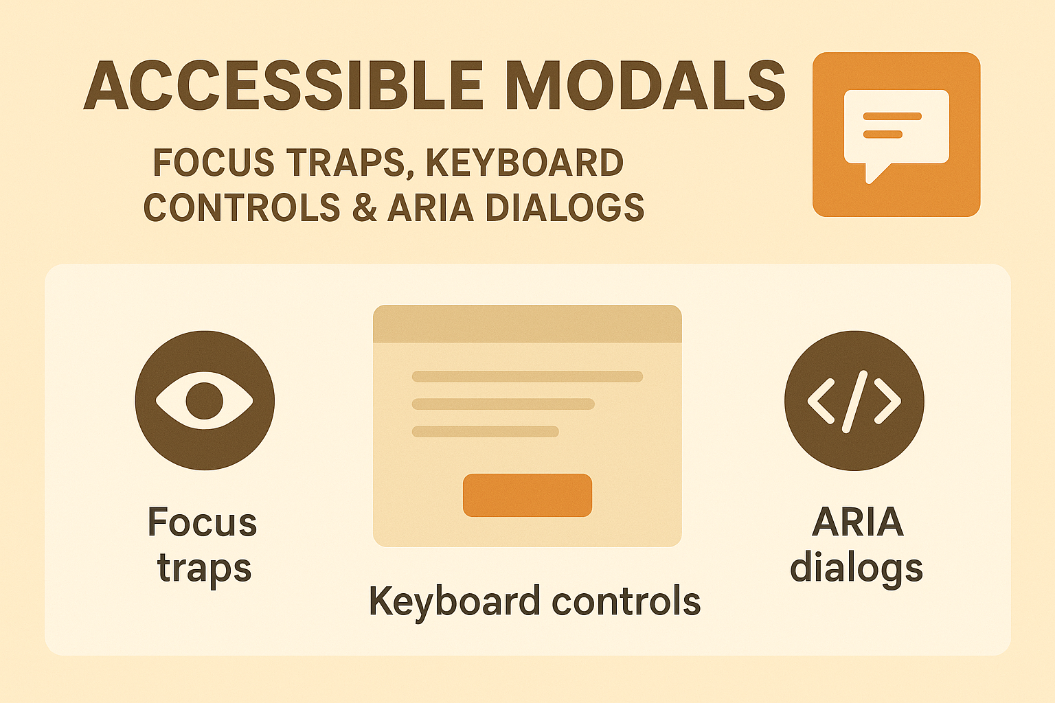
Accessible Modals — Focus Traps, Keyboard Controls & ARIA Dialogs
Accessible Modals — Focus Traps, Keyboard Controls & ARIA Dialogs
Introduction
Modals and dialogs are common interface patterns — used for confirmations, forms, or alerts. However, without proper accessibility handling, they can disorient users, trap keyboard focus, or hide critical information from assistive technologies. Accessible modals ensure that all users can perceive, operate, and dismiss dialogs intuitively using both mouse and keyboard controls.
WCAG 2.2 addresses these principles through Success Criterion 2.1.2 (No Keyboard Trap) and 4.1.2 (Name, Role, Value), requiring predictable focus behavior and exposure of modal context to assistive tools.
Why Modal Accessibility Is Critical
- Users relying on screen readers or keyboards cannot access controls if focus moves unexpectedly.
- Overlays must visually and programmatically indicate their purpose and contain user interaction until dismissed.
- Proper focus management ensures that closing dialogs returns users seamlessly to their previous position.
Semantic Structure of Accessible Modals
The foundation of accessible modals is correct semantic structure. Use a container that explicitly defines its dialog role and ownership of labels and descriptions:
<div
  role="dialog"
  aria-modal="true"
  aria-labelledby="dialogTitle"
  aria-describedby="dialogDesc"
>
  <h2 id="dialogTitle">Subscribe to our newsletter</h2>
  <p id="dialogDesc">Get monthly updates on accessibility and UX best practices.</p>
  <form>
    <label for="email">Email</label>
    <input type="email" id="email" required />
    <button type="submit">Subscribe</button>
  </form>
  <button type="button" aria-label="Close dialog">×</button>
</div>
- aria-modal="true" — Prevents background content from being read.
- aria-labelledby — Refers to the modal’s title.
- aria-describedby — Connects details or supporting content.
Managing Focus
Focus handling is key to modal accessibility. When modals open, focus must move inside the dialog; when they close, focus must return to the triggering element.
// Example (vanilla JS)
const openButton = document.getElementById('openModal');
const modal = document.getElementById('myModal');
const closeButton = modal.querySelector('[aria-label="Close dialog"]');

openButton.addEventListener('click', () => {
  modal.showModal();
  closeButton.focus();
});

closeButton.addEventListener('click', () => {
  modal.close();
  openButton.focus();
});
Ensure no background element receives focus while the dialog is open.
Focus Trapping
Prevent users from tabbing outside a modal while it’s active. This ensures logical navigation containment.
const focusableElements = modal.querySelectorAll(
  'a[href], button, textarea, input, select, [tabindex]:not([tabindex="-1"])'
);
const first = focusableElements[0];
const last = focusableElements[focusableElements.length - 1];

modal.addEventListener('keydown', e => {
  if (e.key === 'Tab') {
    if (e.shiftKey && document.activeElement === first) {
      e.preventDefault();
      last.focus();
    } else if (!e.shiftKey && document.activeElement === last) {
      e.preventDefault();
      first.focus();
    }
  }
});
Libraries like React Focus Lock or focus‑trap‑vue simplify handling focus loops in SPAs.
Keyboard Controls
- Esc — Closes the modal (must always work).
- Tab / Shift + Tab — Moves through focusable elements.
- Enter / Space — Activates buttons or form controls.
Do not disable system-level shortcuts or remap existing behaviors unexpectedly.
ARIA Roles for Different Dialog Types
- role="dialog" — Standard modal windows for content and forms.
- role="alertdialog" — For urgent confirmations (e.g., “Delete item?”) that require immediate action.
<div role="alertdialog" aria-modal="true" aria-labelledby="alertTitle">
  <h2 id="alertTitle">Delete this file?</h2>
  <button>Cancel</button>
  <button>Delete</button>
</div>
Overlay and Background Accessibility
When a modal opens:
- Hide background containers using
aria-hidden="true". - Prevent scroll within the page body (
overflow: hidden;). - Ensure the overlay contrast and opacity do not obscure active modal contents.
Testing Modal Accessibility
Use both manual and automated accessibility testing:
- Open the modal using only the keyboard and ensure focus moves correctly.
- Press Esc to close and confirm focus returns to the trigger.
- Run WAVE or axe DevTools to validate ARIA and labeling.
- Use screen readers to ensure dialog content and relationships are announced properly.
Common Accessibility Issues
- Focus lost to background: Users tab out of the active modal unexpectedly.
- Multiple modals open simultaneously: Causes screen reader and focus confusion.
- Hidden dialogs in DOM: Non-active modals should not exist without
hiddenoraria-hidden="true". - Improper ARIA use: Conflicting
aria-modalor missingaria-labelledbydefinitions.
Conclusion
Accessible modals balance control and clarity. By managing focus, providing keyboard support, and defining ARIA semantics correctly, modals become inclusive instead of intrusive. Every user — regardless of ability or device — should be able to open, interact with, and close dialogs seamlessly.
Next Steps: Audit your modals and overlays for proper focus trapping and keyboard controls. Refactor to implement aria-modal="true" and consistent labeling patterns to comply with WCAG 2.2 standards.


