

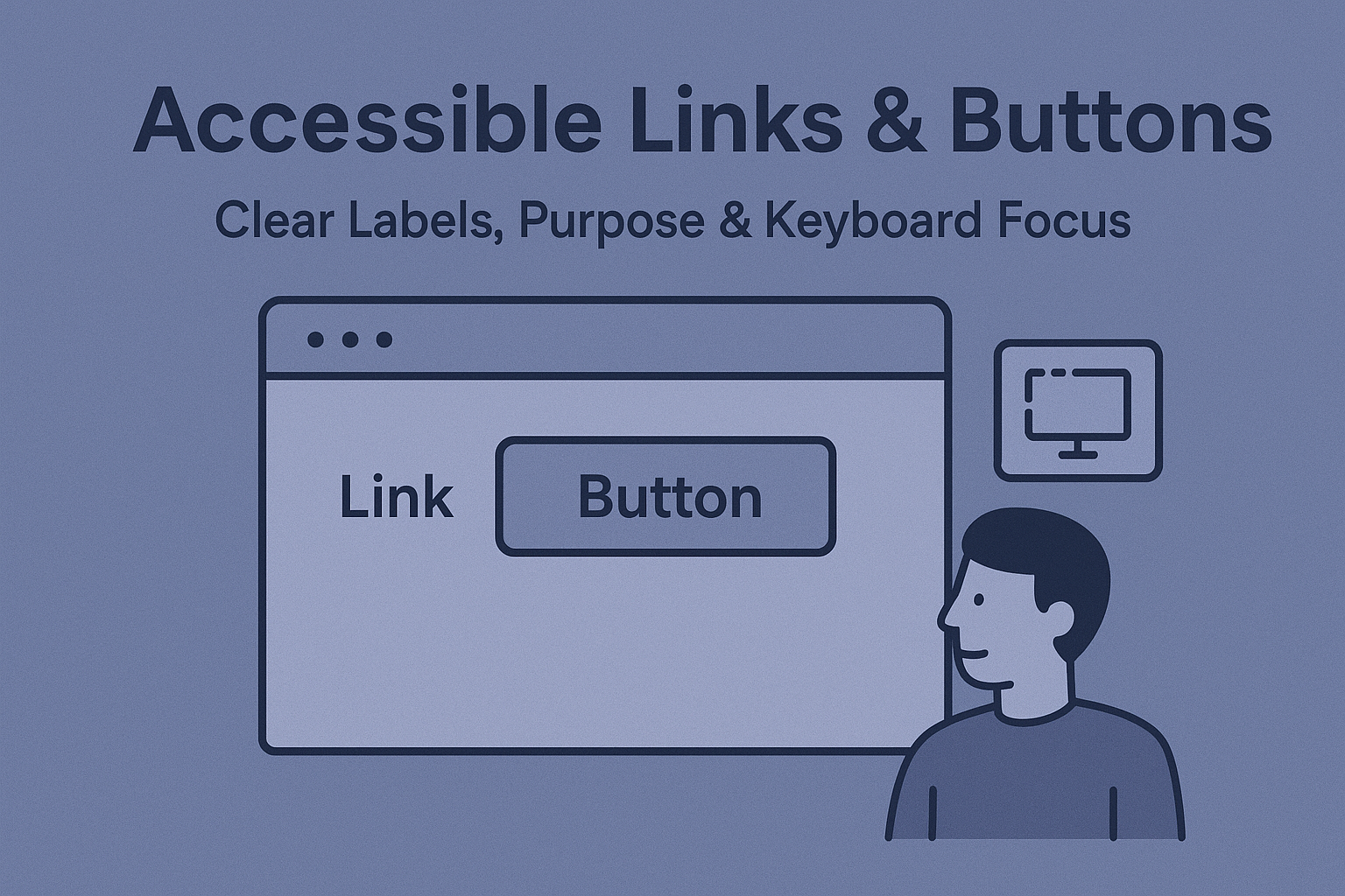
Accessible Links & Buttons — Clear Labels, Purpose & Keyboard Focus
Accessible Links & Buttons — Clear Labels, Purpose & Keyboard Focus
Introduction
Links and buttons are among the most common interface elements on any website or application. Yet they are also the most misused. Non-descriptive text, missing labels, or clickable elements masquerading as non-interactive content all cause accessibility barriers. Ensuring your links and buttons are correctly coded and labeled allows users of assistive technologies — such as screen readers, keyboards, and voice controls — to navigate and interact confidently.
According to WCAG 2.2 Success Criteria 2.4.4 (Link Purpose – In Context) and 4.1.2 (Name, Role, Value), interactive elements must convey their intent, state, and function clearly.
Why Accessible Links and Buttons Matter
- Screen reader users depend on meaningful link text to understand navigation without reading surrounding content.
- Keyboard users rely on focus indicators and predictable tab order to move efficiently through content.
- Assistive technology users need consistent semantics to distinguish between “link” vs “button” behavior.
When to Use Links vs Buttons
Although they often appear similar, links and buttons serve different purposes:
- Use a link (
<a>) when navigating to another page or section. - Use a button (
<button>) when performing actions — submitting forms, toggling views, opening modals, etc.
<a href="/about">Learn more about us</a>

<button type="button">Submit feedback</button>
Creating Descriptive Link Text
Links should make sense out of context. Avoid vague labels like “Click here” or “Read more.” Instead, use actionable, descriptive language.
- ✅ Do: “Download the 2024 Accessibility Report (PDF)”
- ❌ Don’t: “Click here for report”
For screen readers, descriptive link text improves understanding and navigation through the “Links List” feature.
Accessible Buttons with Proper Labels
Ensure that all buttons include visible text or an accessible name via aria-label or aria-labelledby when icons are used.
<button aria-label="Search">
  <svg role="img" aria-hidden="true">...</svg>
</button>

<button aria-labelledby="closeText">
  <svg aria-hidden="true">...</svg>
  <span id="closeText">Close</span>
</button>
Use concise, accurately descriptive names that reflect the button’s function — “Play video,” “Add to cart,” “Submit form,” etc.
Keyboard Focus & Navigation
Focus visibility is critical for users navigating without a mouse. Ensure all links and buttons are reachable with Tab and operable via keyboard shortcuts.
- Do not remove focus outlines using
outline: none;. - Provide custom but visible focus styles for branding purposes.
- Keep logical tab order matching the visual flow of the page.
- Return focus appropriately when modals or overlays close.
button:focus,
a:focus {
  outline: 3px solid var(--focus-color);
  outline-offset: 2px;
}
ARIA Roles & States
When creating custom interactive components (e.g., when div or span must act like buttons), define their roles and keyboard behaviors explicitly.
<div
  role="button"
  tabindex="0"
  aria-pressed="false"
  onclick="toggleState()"
  onkeydown="if(event.key==='Enter' || event.key===' '){toggleState();}"
>
  Toggle view
</div>
Prefer native elements whenever possible — using ARIA and keyboard events introduces extra complexity and risk if not properly implemented.
Color & Contrast Guidelines
- Ensure link and button text maintains a minimum contrast ratio of 4.5:1 against background.
- Provide color and style variations to differentiate visited, active, and hover states.
- Underline links by default or ensure a non-color cue (contrast, weight, or shape) signals clickability.
Testing Accessible Links & Buttons
To validate accessibility, test with both assistive technology and keyboard navigation:
- Navigate through all interactive elements using Tab and Shift + Tab.
- Verify that links announce their purpose in screen readers.
- Confirm focus visibility with sufficient color contrast.
- Use tools like WAVE and axe DevTools to detect missing labels or roles.
Common Accessibility Issues
- Non-descriptive link text: Users lack context.
- Using divs for buttons: Missing role or keyboard functionality breaks operability.
- Invisible focus styles: Keyboard users can’t track navigation.
- Improper nesting: Buttons placed inside links or vice versa create invalid markup.
Conclusion
Clear, descriptive, and keyboard-accessible links and buttons define the foundation of inclusive interaction. By combining meaningful text, visible focus indicators, and semantic semantics, you comply with WCAG 2.2 guidelines — and create smoother, more enjoyable interactions for all users.
Next Steps: Audit all links and buttons for clear labels and focus visibility. Replace non-semantic clickable elements with proper HTML tags, and implement design system standards that make accessibility effortless.


