

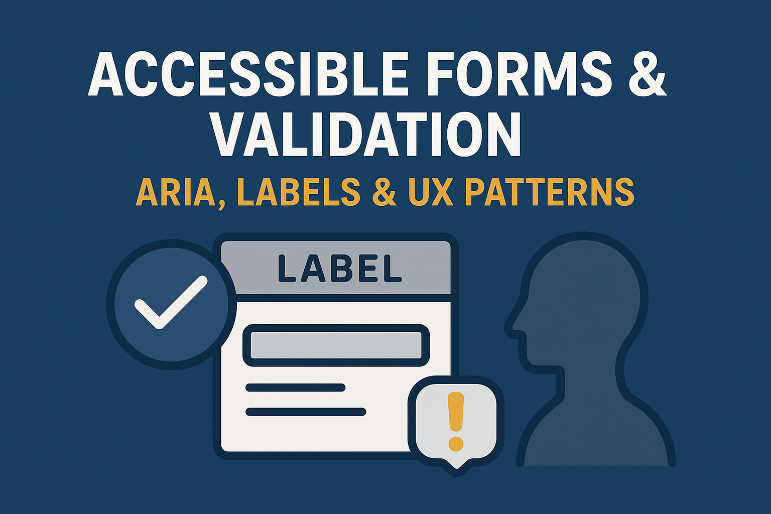
Accessible Forms & Validation — ARIA, Labels & UX Patterns
Accessible Forms & Validation Patterns
Introduction
Forms are one of the most interactive components of the web, yet they are often a major source of accessibility barriers. For users with disabilities, badly structured forms—those without proper labels, focus management, or validation feedback—make completing actions frustrating or impossible. Accessible form design ensures input fields, buttons, and error messages are perceivable, operable, and understandable for all users.
Following established guidelines from the Web Content Accessibility Guidelines (WCAG) and leveraging ARIA attributes responsibly allows developers to create inclusive and compliant forms that work smoothly across assistive technologies like screen readers and voice input tools.
Why Accessible Forms Matter
Well‑coded forms support a wide variety of users, including those who:
- Use screen readers or braille displays to interpret form controls.
- Rely on keyboard or switch devices to navigate and submit data.
- Have cognitive or attention‑related challenges that make error recovery difficult.
- Depend on speech‑to‑text software and need clear, meaningful labels.
Accessible forms help prevent user drop‑off, reduce submission errors, and fulfill legal obligations under the ADA, Section 508, and EN 301 549.
Core Principles of Accessible Form Design
1. Clear and Explicit Labels
Every form control—text fields, radio buttons, checkboxes, dropdowns—must have an associated visible label. Use the <label> element connected via the for attribute, or the aria-label attribute where a visual label cannot be rendered. This helps assistive technologies announce field purposes correctly.
2. Group Related Fields
Use fieldsets and legends to group related inputs logically. For example, gender or contact preference options can be grouped:
<fieldset>
  <legend>Contact Preferences</legend>
  <label><input type="checkbox"> Email</label>
  <label><input type="checkbox"> SMS</label>
</fieldset>
This helps screen readers communicate relationships between options.
3. Keyboard Accessibility
All input fields, buttons, and interactive controls must be operable using only a keyboard. Ensure the tab order follows a logical sequence, and avoid custom widgets that intercept native keyboard behavior without accessible alternatives.
4. Use Appropriate Input Types
Using HTML5 input types such as email, tel, number, and date helps mobile devices present proper on‑screen keyboards and improves validation feedback for all users.
Accessible Validation Patterns
Validation is critical to form usability. Errors should be announced, visible, and contextual without overwhelming the user.
1. Provide Real‑Time Feedback
If possible, validate input fields as users type—indicating errors or success early. Use clear messaging, not only color, to indicate validity. For instance, use an icon with descriptive text such as “Password must include at least 8 characters” rather than just showing a red border.
2. Announce Errors with ARIA
Use aria-live="assertive" or aria-describedby attributes to ensure screen readers announce validation feedback as it appears. For example:
<input id="email" aria-describedby="emailError">
<span id="emailError" role="alert">Please enter a valid email address.</span>
3. Avoid Color‑Only Indicators
Never rely solely on red or green color to indicate errors or success. Combine color changes with text or icons to communicate state to color‑blind or low‑vision users.
4. Focus Management After Errors
After form submission, move focus to the first error field so users do not need to hunt for it. Use JavaScript to set focus() dynamically on problematic fields after reload or validation failure.
Best Practices for Accessible Forms
- Keep form instructions concise and visible at the top, using markup like
<p>before the first field. - Mark required fields with an asterisk only if explained (e.g., “* required”).
- Use consistent error message placement—preferably below each field.
- Allow users to correct multiple errors at once without resetting successfully entered data.
- Maintain logical tab order and clear focus outlines for all elements.
- Test on multiple screen readers (NVDA, JAWS, VoiceOver) to confirm label‑field announcement accuracy.
Tools for Accessibility Testing
Use tools such as:
- WAVE – Detects missing form labels and ARIA issues.
- axe DevTools – Identifies incomplete or redundant ARIA attributes.
- W3C Validator – Ensures proper HTML structure and syntax, including label associations.
Common Issues to Avoid
- Labels missing or visually present but not programmatically associated with inputs.
- Placeholder text used as the only means of labeling.
- Error messages that rely solely on color or appear below the fold without focus redirection.
- Automated form resets after validation failure.
Conclusion
Accessible forms provide equal access for all users to submit, register, or interact effortlessly. From clear labels to dynamic, ARIA‑based validation, implementing inclusive form patterns benefits everyone—including those using assistive technologies or navigating by keyboard alone.
Next steps: Audit your existing forms for missing labels and unclear error handling. Apply ARIA alerts and validation cues to ensure all users receive clear feedback while interacting with your interfaces.


