

Accessible Forms in SPAs — Dynamic Updates & Validation for React, Vue, and Angular
Accessible Forms in SPAs — Dynamic Updates & Validation for React, Vue, and Angular
Introduction
Forms in single-page applications (SPAs) are often highly dynamic — updating inline, rendering conditionally, and validating in real time. While this enhances usability, it introduces accessibility challenges for assistive technology users who may not perceive or track these updates. Ensuring that every change, validation, and confirmation is programmatically communicated is crucial for compliance and usability.
This guide explores how to implement accessible, WCAG-compliant forms in React, Vue, and Angular, covering best practices for ARIA usage, focus management, and polished real-time feedback experiences.
Why Accessibility in SPA Forms Matters
- Dynamic DOM updates can occur without page reloads — screen readers may miss new content if not announced properly.
- Validation errors that aren’t described programmatically leave users stuck or uninformed.
- Custom components (switches, dropdowns) often lack native semantics if not correctly implemented.
Accessible SPA forms unite reactivity with communication — ensuring users always know what has changed and why.
Primary Challenges with SPA Form Accessibility
- Missing keyboard focus after route transitions or modal form openings.
- No announcement of inline errors or success messages.
- Dynamic components injected or replaced without ARIA updates.
- Custom input widgets that do not expose role, name, or state correctly.
Core Strategies for Accessible SPA Forms
1. Label Every Input and Control
All input fields must have visible labels or programmatically associated text via aria-label or aria-labelledby.
<label for="email">Email address</label>
<input id="email" name="email" type="email" aria-required="true" />
2. Manage Focus on Dynamic Updates
After route transitions, modal openings, or error displays, move keyboard focus appropriately:
// React Example
useEffect(() => {
  if (formRef.current) formRef.current.focus();
}, [isModalOpen]);
Preserving focus prevents users from losing orientation when views change without reloading the page.
3. Announce Validation & Status Messages
Use aria-live regions to convey real-time changes automatically:
<div aria-live="assertive" id="errorBox">Email address is required.</div>
This ensures screen readers announce validation results as soon as they appear.
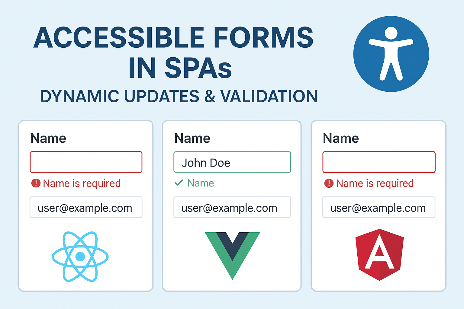
Framework-Specific Examples
React
function AccessibleForm() {
  const [error, setError] = useState("");
  const [success, setSuccess] = useState("");
  const submitHandler = e => {
    e.preventDefault();
    if (!e.target.email.value) setError("Email is required");
    else {
      setError("");
      setSuccess("Form submitted successfully!");
    }
  };
  return (
    <form onSubmit={submitHandler}>
      <label htmlFor="email">Email</label>
      <input id="email" aria-describedby="feedback" />
      <div id="feedback" aria-live="assertive">{error || success}</div>
      <button type="submit">Submit</button>
    </form>
  );
}
Vue
<template>
  <form @submit.prevent="submitForm">
    <label for="username">Username</label>
    <input id="username" v-model="username" :aria-describedby="'message'" />
    <div id="message" aria-live="polite">{{ feedback }}</div>
    <button type="submit">Submit</button>
  </form>
</template>

<script setup>
import { ref } from 'vue';
const username = ref('');
const feedback = ref('');
function submitForm() {
  feedback.value = username.value ? 'Form submitted!' : 'Please enter your username.';
}
</script>
Angular
<form (ngSubmit)="onSubmit(form)" #form="ngForm">
  <label for="phone">Phone Number</label>
  <input id="phone" name="phone" aria-describedby="notice" ngModel required />
  <div id="notice" aria-live="assertive">{{feedback}}</div>
  <button>Submit</button>
</form>
Handling Dynamic Form Sections
In SPAs, forms often expand or collapse conditionally. Ensure hidden sections use proper ARIA states:
<div id="moreOptions" aria-hidden="true">...</div>
When toggled open, switch aria-hidden="false" and move focus to the first focusable child input.
Error Summary Patterns
List all errors at the top of the form so users can easily locate and fix them:
<div role="alert" tabindex="-1">
  <h2>Please fix the following errors</h2>
  <ul>
    <li><a href="#email">Email is required</a></li>
  </ul>
</div>
Best Practices
- Always ensure form controls preserve labels and focus after re-renders.
- Provide non-disruptive error announcements through polite live regions.
- Avoid changing DOM structure in ways that reset screen reader context.
- Design success confirmations as inline updates instead of modals when possible.
Testing SPA Form Accessibility
- Run through form submission using keyboard only.
- Use screen readers (JAWS, NVDA, VoiceOver) to check if updates are announced automatically.
- Simulate validation states to ensure appropriate aria-live feedback.
- Inspect accessibility trees in React, Vue, and Angular dev tools extensions.
Common Accessibility Errors in SPA Forms
- Silent validation: Errors appear visually but are not read programmatically.
- Focus loss on re-render: Users must start over after every state update.
- Improper aria-hidden usage: Hidden sections remain readable by screen readers.
- Missing descriptive labels: Placeholder-only inputs confuse assistive technologies.
Conclusion
Accessible form logic in SPAs combines reactive power with thoughtful user communication. By integrating live announcements, consistent focus management, and native semantics into modern frameworks, you create form experiences that remain inclusive across every dynamic update.
Next Steps: Review your SPA forms for validation announcements, focus stability, and ARIA accuracy. Document practices in your design system to ensure future form patterns remain accessible by default.


