

Accessible Dynamic Forms — Labels, Errors & Real-Time Validation
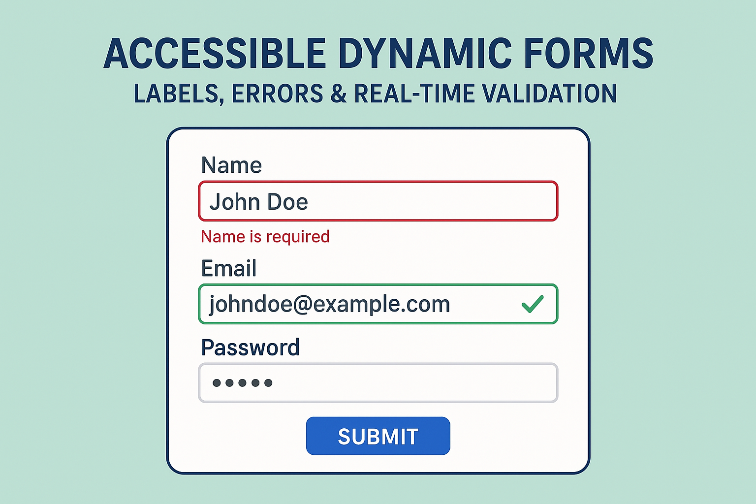
Forms are among the most critical interactive elements in digital experiences — from sign-ups to checkout flows. However, poorly structured forms can easily exclude users who rely on keyboards or screen readers. Dynamic validation, missing labels, and unclear error feedback often make form completion impossible for users with visual or cognitive disabilities. Ensuring your forms meet accessibility standards guarantees usability for everyone, not just compliance. According to WCAG 2.2 Success Criteria 3.3.1 (Error Identification) and 3.3.2 (Labels or Instructions), form inputs must provide clear, perceivable feedback. Accessibility ensures that input relationships, validation alerts, and help text are available for both visual and non-visual users. Each form control must have a visible label programmatically tied to the input. Use This structure informs screen readers that these options belong to the same question. Forms with instant feedback must announce validation messages programmatically. Use When an error occurs, populate the message dynamically: Real-time validation should assist users without being intrusive. Provide feedback when users move between fields or after a logical delay.Accessible Dynamic Forms — Labels, Errors & Real-Time Validation
Introduction
Why Accessible Forms Matter
Structuring Accessible Labels
<label for="email">Email address</label>
<input type="email" id="email" name="email" required />
for and id attributes to associate fields.
Accessible Field Grouping
<fieldset> and <legend> to group related inputs:<fieldset>
<legend>Preferred Contact Method</legend>
<label><input type="radio" name="contact" value="email" /> Email</label>
<label><input type="radio" name="contact" value="phone" /> Phone</label>
</fieldset>
Dynamic Error Messages with ARIA Live Regions
aria-live to create dynamic, accessible feedback loops.<div aria-live="assertive" id="error-msg" class="error"></div>
<input
id="username"
type="text"
aria-describedby="error-msg"
aria-invalid="true"
/>
document.getElementById("error-msg").textContent = "Username cannot be empty.";
aria-invalid="true" signals an invalid field.aria-describedby links the error message to the relevant input.aria-live ensures screen readers announce new content immediately.
Accessible Real-Time Validation
aria-live="polite") for non-critical updates.
Accessible forms must be fully usable using only a keyboard: After validating and submitting, programmatically move focus to the confirmation or summary region (for example, via For forms with multiple errors, include a summary at the top for quick navigation: This helps users locate and correct invalid inputs without scanning the entire form. Validate both the user interface and assistive technology experience: Accessible forms prioritize clarity, context, and flexibility for all users. By integrating ARIA feedback mechanisms, focus management, and proper labeling, developers can ensure forms meet WCAG 2.2 guidelines while delivering a smooth, inclusive user experience for everyone. Next Steps: Audit your site’s forms for label associations, dynamic validation announcements, and error summaries. Establish reusable, accessible form patterns in your component library for consistency across your entire platform.Keyboard & Focus Management
element.focus()).
Error Summary Pattern
<div role="alert" tabindex="-1" id="error-summary">
  <h2>Please fix the following errors:</h2>
  <ul>
    <li><a href="#email">Email address is required</a></li>
    <li><a href="#password">Password must be at least 8 characters</a></li>
  </ul>
</div>
Testing Accessible Forms
Common Accessibility Mistakes
label associations with inputs.
Conclusion


