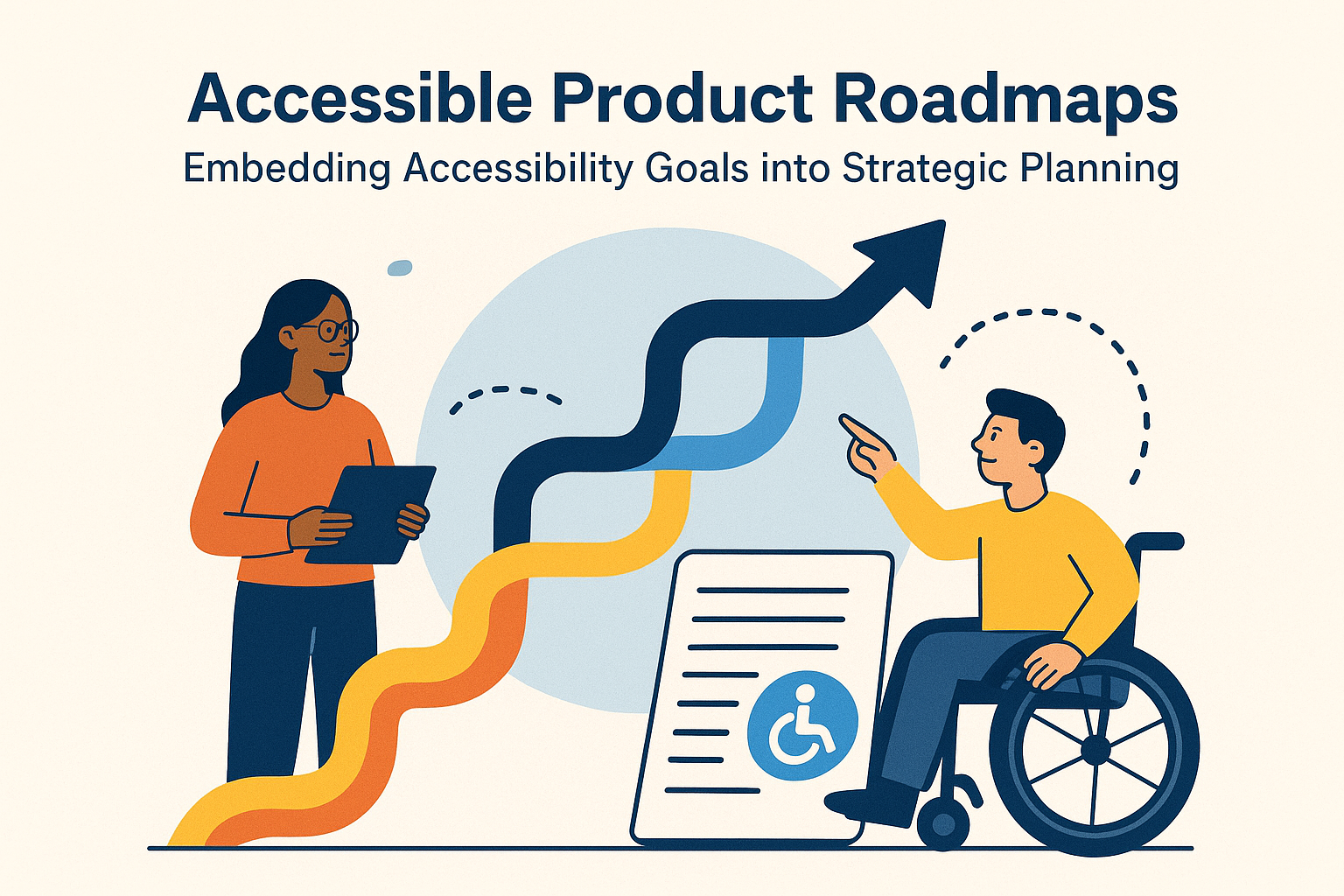

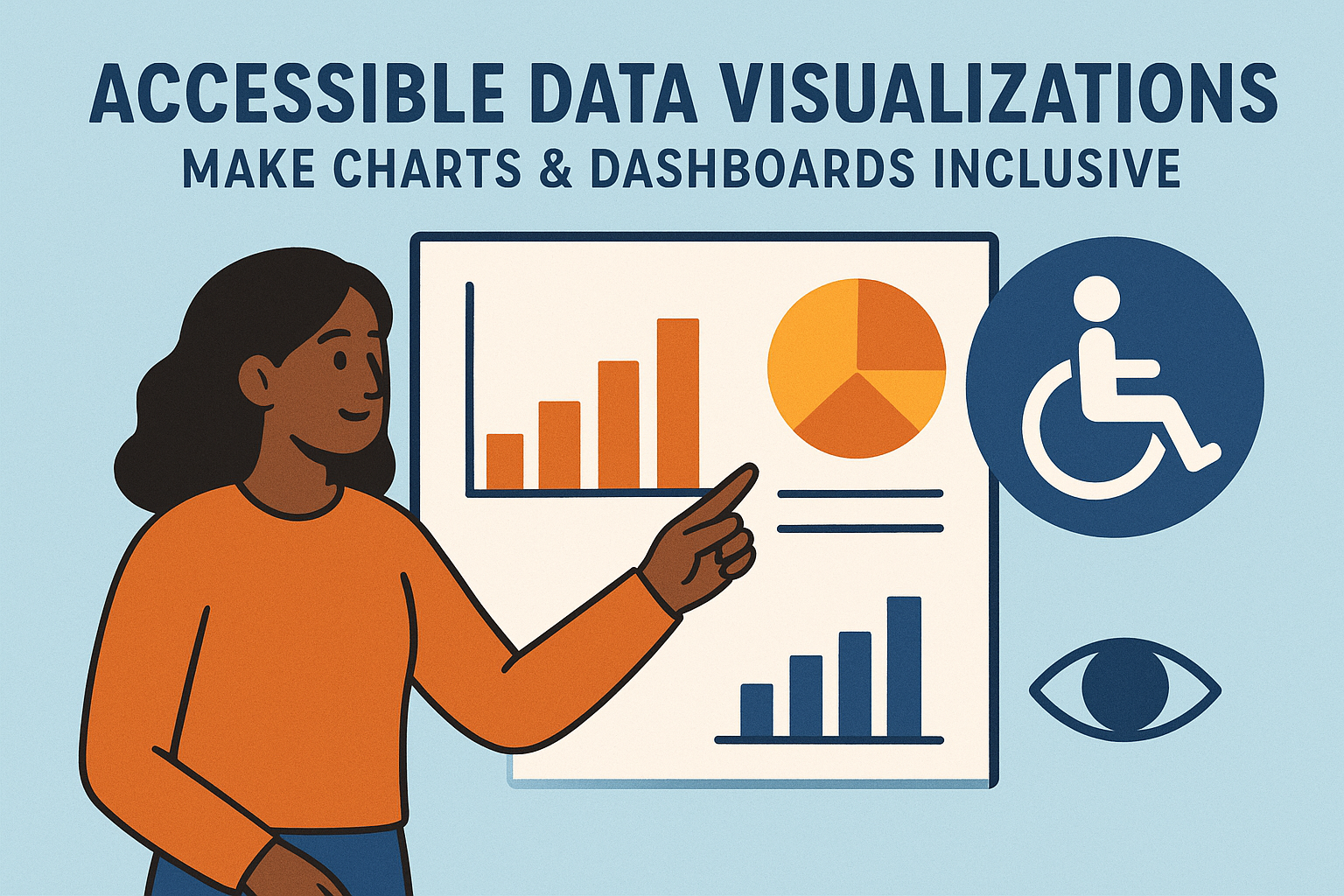
Accessible Data Visualizations — Make Charts & Dashboards Inclusive
Accessible Data Visualizations & Charts
Introduction
Data visualizations such as dashboards, maps, graphs, and infographics reveal patterns that help people make decisions. However, users of assistive technology—like screen readers—often can’t interpret these visuals if they lack text alternatives or structured data. Accessible data visualization turns complex charts into inclusive, understandable information for everyone, regardless of disability or device.
Making charts accessible isn’t just about compliance with WCAG 2.2—it’s about ensuring equal understanding. By providing text descriptions, labels, and keyboard operability, developers can turn inaccessible graphics into usable and informative assets.
Why Accessible Data Visualization Matters
- Ensures blind and low‑vision users can perceive numerical and graphical data.
- Improves comprehension for users with cognitive or learning disabilities.
- Allows data extraction via assistive technology for analysis and comparison.
- Reduces compliance risk while improving user trust and experience.
Everyone benefits from better‑structured data presentation—clarity, discoverability, and usability increase across all audiences.
Key WCAG & ARIA Principles
Relevant guidelines include:
- 1.1.1 Non‑Text Content: Provide text alternatives for charts, diagrams, and infographics.
- 1.3.1 Info and Relationships: Preserve data relationships using table headers, axes, and meaningful grouping.
- 2.4.6 Headings and Labels: Clear and descriptive titles help users orient within dashboards.
- 4.1.2 Name, Role, Value: Interactive data components must expose programmatic roles and values via ARIA or native semantics.
Designing Accessible Visualizations
1. Provide Text Alternatives
Always provide an explanatory text summary describing what the chart communicates. For example: “Sales increased by 25% between 2022 and 2023, with Q4 showing the highest growth.” This allows screen reader users to understand the main takeaway even if they can’t see the chart.
2. Include an Underlying Data Table
Pair visuals with HTML tables that present the same data in tabular form. Tables must have:
- Proper
<th>to identify column and row headers. - Caption summarizing chart context.
- Readable numeric values and units of measure.
<table>
  <caption>Quarterly Sales Growth, 2022–2023</caption>
  <thead>
    <tr><th>Quarter</th><th>Sales ($M)</th><th>Growth (%)</th></tr>
  </thead>
  <tbody>
    <tr><td>Q1 2022</td><td>2.4</td><td>‑</td></tr>
    <tr><td>Q1 2023</td><td>3.0</td><td>+25%</td></tr>
  </tbody>
</table>
3. Use Sufficient Color Contrast
Color differences must have at least a 4.5:1 contrast ratio. Avoid using color alone to show data distinctions—add patterns, textures, or labels to reinforce meaning.
4. Label Interactive Elements
Interactive charts—like filters, sliders, or tooltips—should expose accessible names, roles, and values. For example:
<div role="slider" aria-valuemin="0" aria-valuemax="100" aria-valuenow="60" aria-label="Timeline zoom percentage"></div>
This ensures screen readers announce control state to the user.
5. Responsive & Device‑Independent Interaction
Ensure data visualizations work across screens and input types. Users should be able to zoom, resize, and interact via keyboard, mouse, or touch interchangeably.
Accessible Patterns for Common Chart Types
Bar & Line Charts
- Include chart titles, axis titles, and clear units (e.g., “Sales in USD”).
- Provide textual summaries comparing largest/smallest or key trends.
- Don’t rely solely on hover tooltips—make data points keyboard‑navigable or summarized in a table.
Pie & Donut Charts
- Add data labels for each slice (percentage, name, and value).
- Use aria‑labels or hidden text to announce data when slices receive keyboard focus.
- Provide textual equivalents for total values and most significant categories.
Dashboards
- Provide skip links allowing keyboard users to jump between widgets.
- Assign clear headings to sections like “Revenue,” “Engagement,” or “Conversions.”
- Ensure dynamic updates use
aria-livefor screen reader announcements.
Tools & Libraries Supporting Accessibility
- Highcharts Accessible Module — Adds ARIA attributes, keyboard nav, and text descriptions automatically.
- D3.js — Can be made accessible with proper SVG roles and
descelements. - Chart.js Accessibility Plugins — Provide labels and ARIA integration.
- Microsoft Power BI and Tableau — Offer built‑in accessibility modes and keyboard navigation improvements.
When using third‑party chart libraries, always test output with screen readers and keyboard navigation to confirm accessibility beyond marketing claims.
Testing Accessible Charts
- Check visual clarity and contrast at various zoom levels.
- Test data reading order using NVDA or VoiceOver.
- Verify that keyboard and tab navigation enables reaching all interactive data points.
- Ensure
aria-liveannouncements describe real‑time data updates correctly.
Common Mistakes
- Using color alone to represent categories.
- Embedding charts as images without any text alternative or data table.
- Neglecting axis labels and titles necessary for understanding scale.
- Relying on tooltips that appear only on hover or mouseover.
Benefits of Accessible Data Visualization
- Improves understanding and usability for all users, not just those with assistive tech.
- Supports compliance and public‑sector transparency requirements.
- Enhances SEO and machine readability for searchable datasets.
- Builds trust by ensuring equal access to critical insights.
Conclusion
Accessible data visualizations transform raw charts into truly communicative experiences. By combining descriptive text, structured data tables, and ARIA labeling, teams make information perceivable to all. Inclusive data isn’t a constraint—it’s clarity enhanced for everyone.
Next steps: Evaluate existing dashboards for accessibility. Add text summaries, build accompanying tables, and test all visuals with screen readers and high‑contrast modes to ensure your data visualizations tell a story everyone can access.