
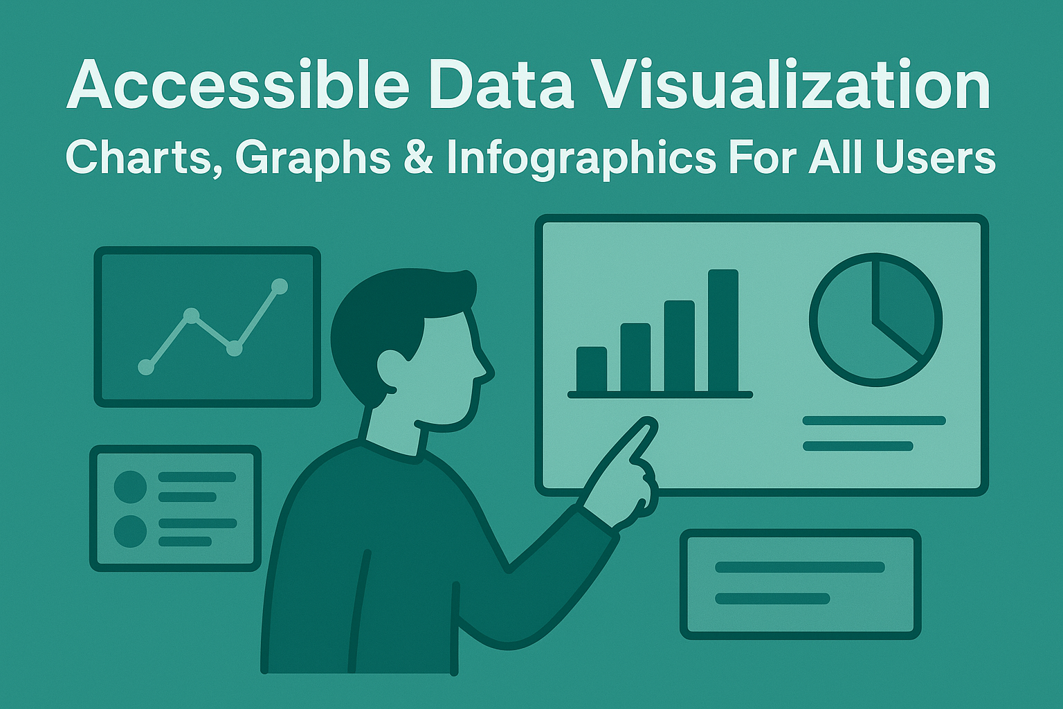
Accessible Data Visualization — Charts, Graphs & Infographics for All Users
Accessible Data Visualization — Charts, Graphs & Infographics for All Users
Introduction
Data visualizations such as charts, graphs, and infographics communicate complex information quickly. However, when these graphics are not properly labeled or described, users with visual, cognitive, or motor disabilities are excluded from understanding critical insights. Accessibility ensures everyone can interpret and interact with your visual data effectively, regardless of the medium or device used.
Creating accessible data visualizations is not just about alternative text — it’s about providing equivalent information, logical interaction, and multiple modes of understanding as required by WCAG 2.2 Success Criteria 1.1.1 (Non-text Content) and 1.3.1 (Info and Relationships).
Why Accessible Data Visualizations Matter
- Enables users with low vision or blindness to access the same insights through text or structured data.
- Improves comprehension for cognitive and neurodivergent users through clarity and structure.
- Expands usability for mobile and speech interface users.
- Meets compliance standards required under WCAG, Section 508, and EN 301 549.
Inclusive data storytelling ensures that accessibility and business intelligence work hand in hand.
Designing Perceivable Visualizations
Ensure that users can distinguish and perceive data regardless of color vision or visual acuity.
- Use text labels and patterns instead of relying solely on color differences.
- Maintain at least a 4.5:1 color contrast ratio between adjacent data segments as per WCAG 1.4.11.
- Provide legible font sizes and scalable SVG-based text for responsiveness.
- Annotate data points with values or callouts when possible.
Providing Data Alternatives
Every chart should have a textual equivalent that conveys the same insights:
- Offer a data table beneath the chart to expose raw values.
- Provide a summary description that explains what the visualization shows, its trends, and any key outliers.
- Use the
<figure>and<figcaption>elements to group visuals and captions semantically.
<figure role="group" aria-labelledby="charttitle">
  <canvas id="salesChart"></canvas>
  <figcaption id="charttitle">
    Sales growth comparison from 2020–2024, showing a steady rise of 45%.
  </figcaption>
</figure>
Accessible SVGs and Canvas Charts
When using SVG or canvas-based visualizations (such as D3.js or Chart.js), add accessibility hooks and focus management.
- Assign ARIA roles like
role="img"orrole="graphics-document"for SVGs. - Use
aria-labeloraria-describedbyto provide textual context. - Make chart elements keyboard focusable only if they're interactive (use
tabindex="0"wisely). - Ensure screen readers can skip repetitive visual elements.
<svg role="img" aria-label="Quarterly revenue bar chart showing steady growth">
  <title>Quarterly Revenue Growth 2023</title>
  <desc>Revenue increased from 1.2M to 2.0M USD between Q1 and Q4.</desc>
  ...data visualization elements...
</svg>
Keyboard and Interaction Accessibility
Interactive visualizations should be operable using both mouse and keyboard. Follow these principles:
- Provide logical focus order through data points, legends, or menu items.
- Enable users to trigger tooltips or details using Enter or Space.
- Ensure hover-based interactions have equivalent focus-based triggers.
- Test navigation flow with assistive technology like NVDA or VoiceOver to confirm expected reading order.
Testing Tools for Accessible Visualizations
Use a mix of automated and manual testing methods to validate accessibility:
- axe DevTools — checks non-text elements and ARIA usage.
- WAVE — identifies missing text alternatives or labels.
- Screen readers (NVDA, JAWS, VoiceOver) — verify that data trends are announced logically.
- Keyboard testing — tab through chart controls and verify focus visibility.
Common Accessibility Issues in Visualizations
- Color-only differentiation: Users with color blindness can’t distinguish categories.
- Missing text descriptions: Charts without text alternatives exclude screen reader users.
- Unreadable text: Font contrasts or font sizes fail WCAG readability criteria.
- Unlabeled interactive elements: Tooltips and clickable areas without ARIA labels confuse assistive tech.
Conclusion
Accessible data visualization is about transforming insights into inclusive communication. By combining semantic markup, textual summaries, strong color contrast, and keyboard support, you can make charts that everyone can understand and engage with — regardless of ability or technology.
Next Steps: Audit your dashboards and infographics, ensure every visual element has a text or data equivalent, and test with screen readers to confirm full accessibility compliance with WCAG 2.2.