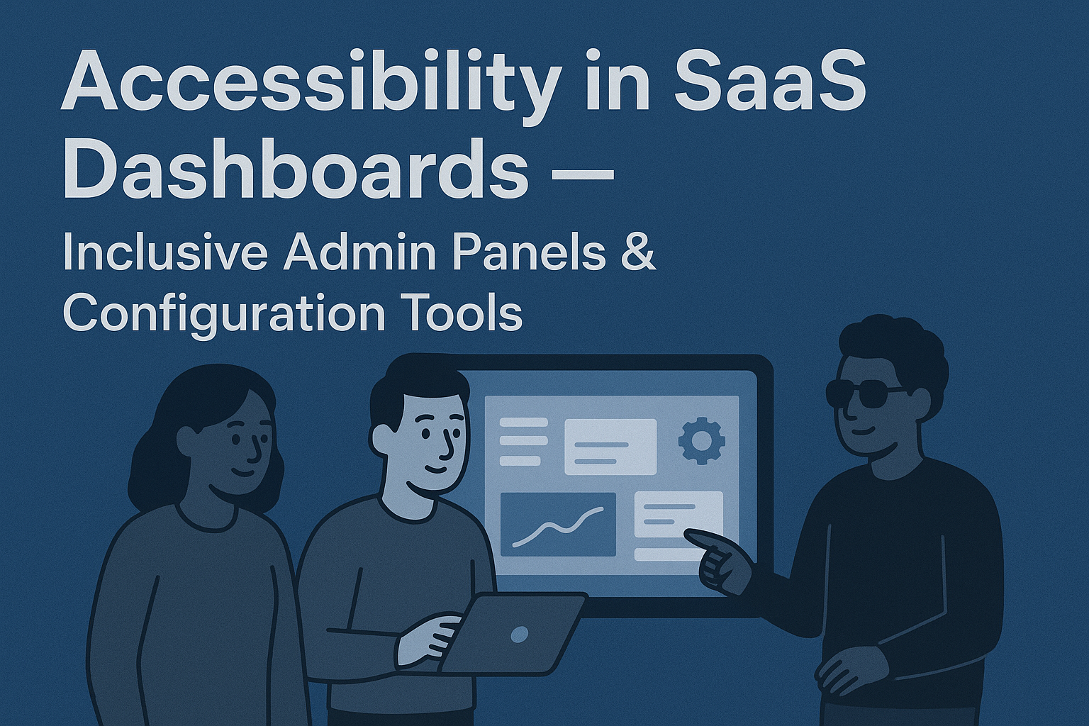
Accessibility in SaaS Dashboards — Inclusive Admin Panels & Configuration Tools
Accessibility in SaaS Dashboards — Inclusive Admin Panels & Configuration Tools
Introduction
SaaS products thrive on complexity — data‑dense dashboards, configurable interfaces, and multi‑step workflows. But for users of assistive technologies, these same strengths can quickly turn into barriers if accessibility isn’t built in from the start. Accessible SaaS dashboards ensure that every administrator, analyst, or manager can read data, configure settings, and make informed decisions regardless of ability or device.
This article explores strategies for designing inclusive SaaS dashboards and admin panels that meet accessibility guidelines while delivering powerful, equitable product experiences.
Why Accessibility in Dashboards Matters
- Empowers users who rely on screen readers, keyboard navigation, or high contrast settings to perform administrative tasks independently.
- Improves clarity for all users — reducing cognitive load, misclicks, and visual clutter.
- Prevents compliance risks under WCAG 2.2 and EN 301 549 for enterprise SaaS contracts.
- Aligns inclusive data visualization with product trust, transparency, and analytics accuracy.
Core Accessibility Focus Areas in SaaS Dashboards
1. Navigation & Structure
- Use consistent, logical structure with
<nav>landmarks and headings (<h1>–<h3>) to define sections like metrics, reports, and settings. - Provide visible focus indicators and skip links to main content areas.
- Ensure side navigation menus are fully operable via keyboard (arrow keys,
Enter,Esc).
2. Forms, Settings & Configuration Panels
- Label all form fields explicitly and associate labels programmatically with their inputs.
- Provide contextual help text, input validation messages, and confirmation states in multiple sensory modes (e.g., text, ARIA live regions).
- Allow adjustable timeouts or auto‑saves to prevent data loss for users who navigate slowly.
3. Data Visualization & Reports
- Offer alternative text summaries for charts and graphs that describe essential trends and outliers.
- Use patterns, labels, and contrasts — not color alone — to represent data differences.
- Support responsive tables that remain keyboard‑navigable and maintain column headers programmatically.
- Provide accessible CSV or data export options for users unable to interact visually with complex visualizations.
Designing Inclusive Dashboard Workflows
Step 1: Model User Roles & Access Needs
SaaS dashboards are used by diverse roles — admins, analysts, editors, and end clients — each with unique accessibility requirements. Conduct research on workflow diversity to identify assistive technology expectations across personas.
Step 2: Create Semantic & Responsive Layouts
- Implement semantic regions using
<main>,<aside>, and<header>elements. - Ensure that dashboard widgets resize or reorganize gracefully without content loss or overlap.
- Preserve reading and tab order consistency between desktop and mobile views.
Step 3: Prioritize Accessibility Testing in CI/CD
Integrate accessibility audits directly into build pipelines for ongoing compliance verification:
name: Accessibility Audit
on: [push]
jobs:
  audit:
    runs-on: ubuntu-latest
    steps:
      - uses: actions/checkout@v4
      - name: Run axe accessibility checks
        run: npx axe https://your-saas-app.example.com/dashboard --save=report.json
      - name: Upload report to Insights
        run: node scripts/uploadAccessibilityResults.js
Step 4: Document Accessible Patterns
- Centralize accessible dashboard components in your design system — cards, charts, tables, and modals.
- Include ARIA patterns and color contrast tokens defined by WCAG AA+ standards.
- Provide code snippets and usage guidelines for engineers implementing accessibility at scale.
Recommended Accessibility Dashboard Metrics Framework
| Metric | Data Source | Frequency | Goal / Benchmark |
|---|---|---|---|
| Dashboard WCAG AA Compliance Rate | axe / Pa11y Automated Tests | Weekly | > 95% of pages passing |
| Keyboard Accessibility Coverage | Manual Tests / Keyboard Audit | Per Release | 100% navigability without mouse |
| Accessible Data Visualization Rate | Design System Audit | Quarterly | > 90% visual components with text alternatives |
| User Satisfaction for Dashboard Accessibility | Survey / Analytics | Bi‑Annually | ≥ 4.5 / 5 satisfaction rating |
Common Pitfalls
- Hidden complexity: Overuse of custom UI frameworks with poor ARIA support.
- Unlabeled charts: Data visualizations without accessible descriptions or headers.
- Keyboard traps: Modals or dropdowns that capture focus indefinitely.
- Color‑driven insights: Red/green contrast for alerts or KPIs without redundant indicators.
Best Practices for Sustainable Accessibility in SaaS UI
- Test frequently with real assistive technology users — not just automated tools.
- Adopt design tokens for contrast, motion, and typography that meet accessibility standards by default.
- Offer multiple visualization styles (table, chart, summary text) for diverse comprehension preferences.
- Include accessibility criteria in product OKRs and definition of done (DoD).
Conclusion
Accessible SaaS dashboards serve a larger mission — making data and control equally available to everyone. By embedding semantic structure, keyboard inclusivity, and accessible data visualizations, teams can eliminate invisible barriers in high‑function products. Accessibility not only ensures compliance but also transforms admin tools into models of clarity, usability, and inclusiveness for every user, everywhere.
Next Steps: Audit your SaaS dashboard for accessibility gaps, document inclusive patterns in your component library, and embed automated checks in your CI/CD pipeline to build an admin experience that’s as powerful as it is accessible.


