

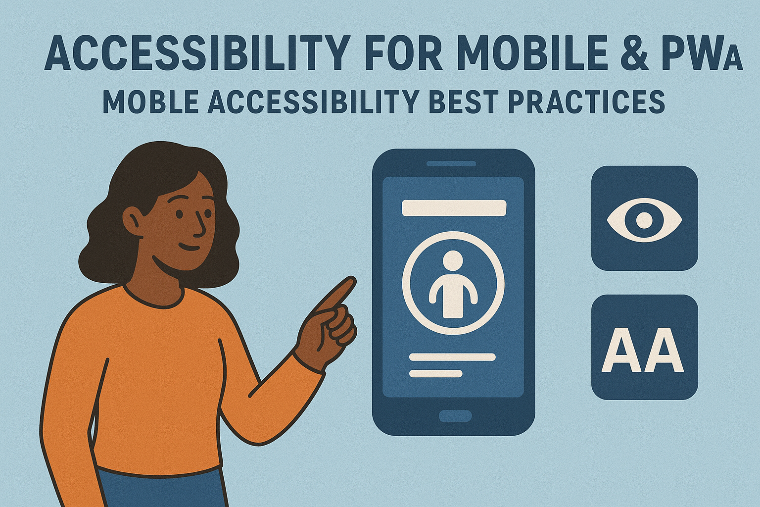
Accessibility for Mobile & PWAs — Mobile Accessibility Best Practices
Accessibility for Mobile & Progressive Web Apps
Introduction
Mobile devices are the primary way many people access the internet. Ensuring accessibility for mobile websites and Progressive Web Apps (PWAs) means designing experiences that work seamlessly with touchscreens, screen readers, voice control, and different device sizes. Accessibility on mobile is not just about smaller screens—it’s about how users of all abilities interact through gestures, sensors, and responsive layouts.
Accessible mobile experiences comply with WCAG 2.2 principles and align with platform-specific guidelines such as Android Accessibility and Apple’s Human Interface Guidelines. PWAs, which blend the web and app worlds, must meet both web accessibility standards and native interaction patterns.
Unique Accessibility Challenges on Mobile & PWAs
Mobile accessibility introduces factors that are less prominent on desktop:
- Touch input: Some users rely on assistive touch or voice control instead of precise taps.
- Smaller screen size: Visual clutter or poor spacing can cause accidental activation of buttons.
- Orientation changes: Content must adapt when switching between portrait and landscape modes.
- System accessibility features: Compatibility with OS-level features like TalkBack, VoiceOver, and magnification.
- Offline and PWA behavior: Ensuring accessibility even when content is cached or partially available offline.
WCAG Guidelines Relevant to Mobile
2.5.1 Pointer Gestures: Provide alternatives to gestures that require multiple fingers or complex paths.
- 2.5.2 Pointer Cancellation: Ensure controls can be activated intentionally, reducing accidental touches.
- 2.5.3 Label in Name: Ensure the visible label text matches the programmatic name, so voice control users can accurately select items.
- 2.5.5 Target Size: Touch targets should be at least 44 × 44 pixels or a similar accessible dimension.
- 1.4.4 Resize Text: Support zoom and font scaling without breaking layout or hiding content.
Designing Accessible Touch Interfaces
Good mobile accessibility starts with thoughtful design of interactive components.
- Keep adequate spacing between tappable elements to avoid accidental activation.
- Provide clear focus indicators and highlight active states for keyboard or switch users.
- Use semantic HTML for buttons and forms within PWAs so they are automatically accessible.
- Support both portrait and landscape modes while maintaining readability.
- Avoid horizontal scrolling except for data tables or essential workflows.
Screen Readers & Assistive Technology Compatibility
Mobile users rely heavily on platform screen readers like VoiceOver (iOS) and TalkBack (Android). Testing with these ensures labels, focus order, and gestures are working correctly.
Testing with VoiceOver
- Activate from iPhone settings under Accessibility → VoiceOver.
- Use swipe gestures to navigate through headings, buttons, and images.
- Ensure all icons and buttons have meaningful accessible names.
- Confirm that dynamic updates and modal dialogs announce changes immediately.
Testing with TalkBack
- Enable TalkBack on Android through Accessibility settings.
- Use linear navigation gestures (left/right swipes) to move through content.
- Ensure proper grouping of form elements and labels with controls.
- Verify that custom views (e.g., cards) use the right roles and focus order.
PWA Accessibility Considerations
Progressive Web Apps blend browser‑based functionality with native‑like features such as service workers, notifications, and offline storage. To make them accessible:
- Ensure offline states include clear messaging and maintain semantic HTML structure even without network connectivity.
- Handle dynamic updates with proper
aria-liveregions. - Ensure keyboard focus persists across page reloads and route changes.
- Provide accessible push notifications (include subject, body, and action labels).
Because PWAs rely on responsive design, each breakpoint must maintain accessible structures—headings, landmarks, and focusable elements should not disappear or change order across
views.
Mobile Form Accessibility
Mobile forms present unique challenges due to on‑screen keyboards and smaller layouts. To ensure accessibility:
- Use appropriate input types (email, number, tel) to trigger correct keyboards.
- Label all fields and ensure placeholders are not used as the only indication.
- Provide sufficient space around submit buttons and error messages.
- Keep forms short and offer auto‑complete or instant validation with clear feedback.
Testing Tools and Resources
- Android Accessibility Test Framework
- Apple Accessibility Inspector
- TalkBack Testing Guide by PowerMapper
- Google Lighthouse – includes mobile accessibility audits.
Common Mobile Accessibility Mistakes
- Touch targets too small or too close together.
- Forms missing visible labels or misaligned focus order.
- Insufficient color contrast under various lighting conditions.
- Modals that trap focus or prevent keyboard and screen reader navigation.
- Interfaces that disable pinch‑zoom or text resizing.
Conclusion
Accessible mobile design ensures that all users—regardless of ability—can comfortably navigate, read, and interact with content. By adhering to WCAG guidelines, testing with real assistive technologies, and designing with touch accessibility in mind, you create experiences that are not only inclusive but more user‑friendly overall.
Next steps: Incorporate accessibility checks into your mobile and PWA QA processes, test early on real devices with assistive tech like VoiceOver and TalkBack, and build mobile design systems that prioritize accessibility from concept to release.


