

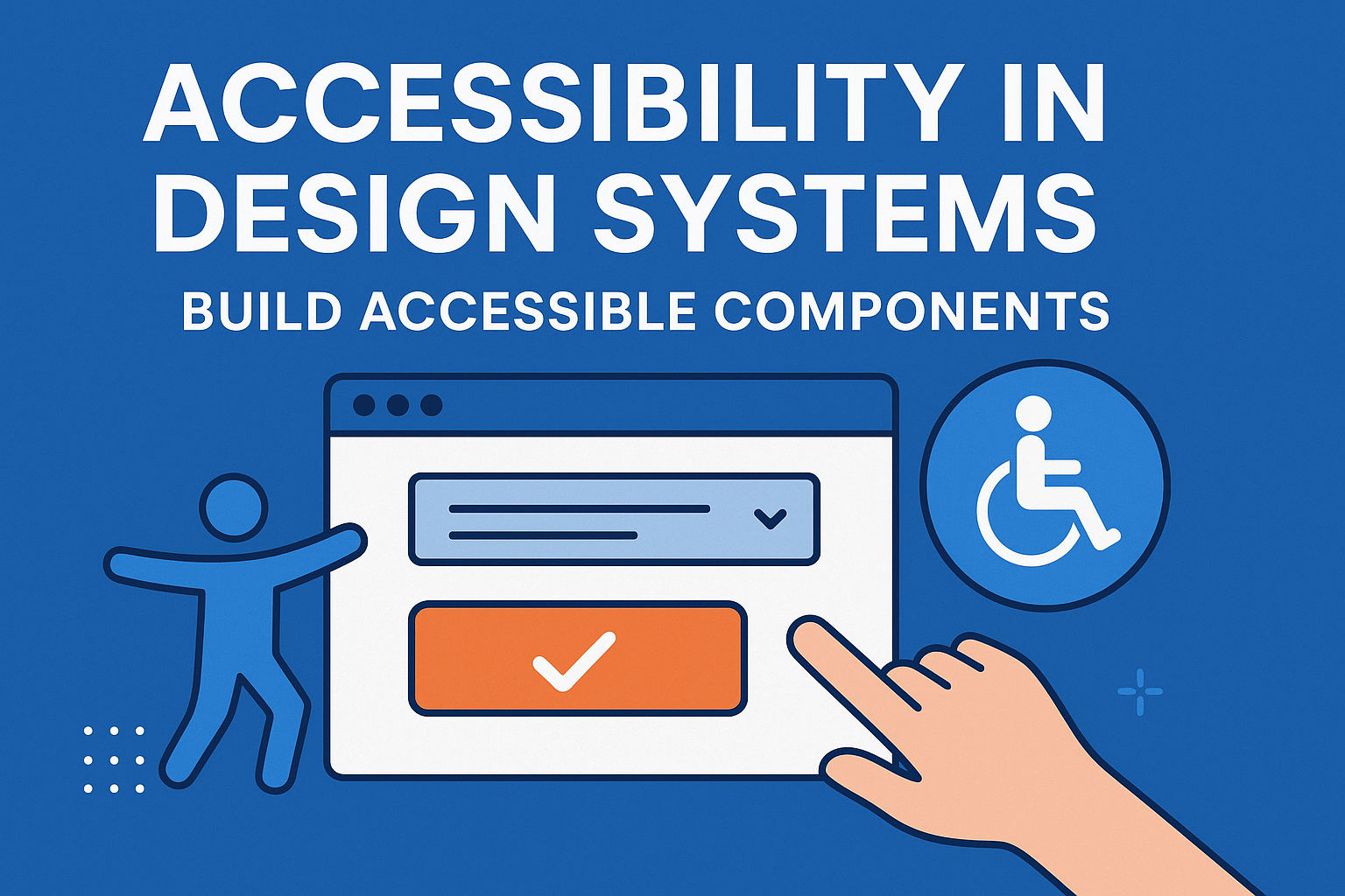
Accessibility in Design Systems — Build Accessible Components
Accessibility in Design Systems & Component Libraries
Introduction
Design systems and component libraries form the backbone of modern digital products. They define consistent UI patterns, visual styles, and code assets across brands and teams. Embedding accessibility into these systems ensures that every new component and interface automatically inherits inclusive, compliant behavior. Accessibility by design is faster, scalable, and far more sustainable than retrofitting accessibility later.
A well‑structured accessible design system aligns UX designers, developers, and product managers around common standards. It reduces production friction, prevents regressions, and creates digital experiences that meet both WCAG 2.2 and user needs from the start.
Why Accessibility in Design Systems Matters
If your design system is accessible, every app and page built with it benefits automatically. Conversely, inaccessible base components replicate barriers across all products. Building accessibility into the foundation creates:
- Consistency: Accessibility patterns repeat reliably across products.
- Efficiency: Developers don’t need to rebuild features or run separate audits for every project.
- Scalability: Updates and bug fixes improve accessibility everywhere simultaneously.
- Reduced Risk: Compliance gaps shrink across the product portfolio.
Core Principles of Accessible Design Systems
1. Use Semantic Foundations
Choose HTML elements that convey functionality natively—<button>, <nav>, <ul>—before adding ARIA roles. Well‑structured markup ensures compatibility with screen readers and reduces reliance on custom scripting.
2. Accessibility Tokens and Variables
Manage color, spacing, and typography with design tokens that align with WCAG contrast and readability requirements. Tokens define accessible defaults for typography size, line height, and color contrast, enforcing consistency across design and code.
3. Keyboard and Focus Behavior
Every interactive component must be navigable and operable via keyboard. Add visible focus indicators and maintain logical tab order. For composite widgets (modals, menus, sliders), capture and return focus appropriately.
4. ARIA & State Management
Apply ARIA roles only when custom elements replicate native behavior (for instance, role="dialog" for custom modals). Ensure dynamic states (expanded, pressed, checked) sync visually and programmatically to keep screen readers informed.
Building Accessibility into Component Libraries
Design systems thrive when accessibility patterns are part of reusable components. Typical accessible components include:
- Buttons & toggles (with proper
aria-pressedoraria-expandedstates). - Modals & dialogs (with focus trapping and
role="dialog"). - Navigation menus & accordions following ARIA patterns.
- Tabs or carousels with keyboard navigation and correct roles.
- Form inputs using
<label>and error associations.
Each component should include accessibility guidelines within its documentation—covering expected keyboard behavior, focus management, ARIA attributes, and contrast compliance.
Inclusive Design Documentation
Maintain accessibility documentation directly inside your design system. Include:
- WCAG mapping for each component.
- Keyboard interactions with examples (Tab, Enter, Escape).
- Screen reader text examples or semantic markup notes.
- Contrast ratio and color palette guidance.
This ensures consistency among designers, developers, and content contributors.
Testing & Validation
Automated Testing
Integrate automated tools such as axe‑core, Accessibility Insights, or WAVE into unit and end‑to‑end test suites. These tools verify pattern compliance during CI/CD builds.
Manual Testing
Validate components with screen readers (VoiceOver, NVDA), keyboard navigation, and color contrast checkers to confirm real‑world usability. Use component sandboxes like Storybook for interactive accessibility tests and developer education.
Governance and Maintenance
Accessibility should be a governance priority within your design system team. Establish:
- Accessibility owners or champions for each design system update.
- Peer reviews focused on inclusive design patterns before merging new components.
- Version control that tracks accessibility changes and regression risks.
- Regular audits to ensure token or component updates maintain WCAG compliance.
Common Pitfalls to Avoid
- Creating visually consistent but inaccessible components that ignore semantics.
- Overriding native focus outlines for aesthetic reasons without alternatives.
- Using color alone to communicate status (e.g., success = green, error = red).
- Forgetting to re‑test accessibility after design token or theme updates.
Benefits of an Accessible Design System
- Faster development with accessibility embedded from the start.
- Reduced technical debt and rework during accessibility audits.
- Improved consistency and trust across teams and users.
- Stronger compliance posture and positive brand perception.
Conclusion
An accessible design system is more than just a style library—it’s a framework for inclusion. Components built with accessibility baked in ensure that accessibility is not forgotten at any stage of the product lifecycle. Teams that make inclusivity a design system principle create better, more universal user experiences.
Next steps: Audit your current design system for accessibility maturity, document inclusive coding patterns, and integrate accessibility tests for every new component before release.


